A humble padawan discovers their ability to do good things, magically moving the light in a spark of imagination, to the benefit of all around them. At some point, a critical exposure to a path which leads to the Dark Side. What follows is a continuous struggle of resisting temptation.
Learning photography is like being the main character of a Star Wars movie. Every good photo you accidentally capture sparks excitement and advances you on a learning progress. It is rarely done without the feedback of those around you: your loved or followed ones reinforce your progress, either positively, or negatively (if you captured an inappropriate moment or pose). Slowly, accident develops into intention. Your training makes you a master of light (kind of…).
But then you encounter advertisement of a new piece of photography gear. Usually not all too different from your present equipment, there is something to be found just within your budget which promises to give you more power. Greed strikes. More advertisements, camouflaged as “reviews”, lure you into buying the upgrade. Time moves on; the next new release of the camera brand you love is attractive. Or you are drawn to the “old used gear is better” route, like I am.
The dark side is everywhere: in warm recommendations, independent reviews, spec sheet comparison tables. And though you immediately recognize its dangerous temptation, the struggle normalizes, for the good or the bad.
Gear acquisition is not principally bad; in fact, buying a better camera model or extending your focal distance range can trigger learning and improvement. However, the marginal benefit of gear acquisition is decreasing, and the important question is where to stop.
This blog post shares some experiences and observations which might help you to resist the Dark Side. Or, at least, it might help you to distinguish the relevant attributes from the buzzwords, and thereby to look beyond the omnipresent latent ads in the camera “community”.
Buying and Reselling
[Imagine here a photo of Luke struggling to lift his x-wing from the swamp on Dagobah.]
On the path of learning photography, attention tends to shift between particular characteristics of gear. For example, my first neural representation of a lens value/quality gradient was heavily aligned towards “the brighter the maximum aperture, the better the lens”. I also picked up the debatable factoid that prime lenses are better than the ones capable of zooming. Then, that factoid got reinforced by the first photo results, even though they were from inexpensive Samyang primes.
I stuck to primes, enjoy manual focusing, but skidded through focal lengths and quality ranges. I went from Samyang to Zeiss, from Fuji to Nikon, and - oh, boy, were those photos better (that’s what I thought - but please read through: maybe it was just my skill which improved). And I bought more old equipment. And on a few occasions, I sold stuff. But, often, parting from camera gear was not satisfying. Certainly not financially.
If you re-sell used gear, expect to get a return of approximately a third of its original value.
Do not see your photography gear as a kind of “investment”. Good lenses cost less than a cart of family food at the super market, and values drop the moment you bought something. I tried re-selling on ebay, “kameratori.fi”, and “mpb.com”. The market is saturated and selling power is in the hand of a few big resellers. Expect them to be stingy. Do not expect to get rich.
If you send gear to the second hand shops, you can easily track the market price of the items you sold them for a much lower turnover. My limited data converges to a net resell value (i.e. “money I received”) of about \(30 \pm 10\) percent of the original price; resellers carry home at least \(30\%\) price margin. I was not able to strike any good selling deals on ebay either, because competition there is professional, and the overhead workload of presenting your offering is considerable.
This is a first reason to not get invested in new gear. It is obvious; just repeating it so you do not get disappointed. I much recommend buying used gear; but keep in mind that middle vendors make a lot of profit.
Because, undoubtedly, having gear is an asset: it enables you to take good photos and capture memories of you and your loved ones, which you can print and cherish. No investment can surpass that value.
The Photography Signal Chain
I hypothesized above that photography gear reviews quickly leave the solid ground of tech specs. Just some keywords which should make you hesitate and analyze.
- 3D pop
- microcontrast
- color rendition
- dynamic range
- color science
- lens character
- bokeh quality
- review independence (“thoughts are my own” // “not sponsored”)1
If you hear any of these, raise your alertness: you are probably being manipulated. Certainly, these qualities exist (e.g., see the discussion here), and photo labs might be able to rigorously measure them. However, there are two caveats: (1) They are almost exclusively discussed in a non-quantitative way. (2) Their effect is much less than what you can achieve with basic exposure.
Maybe my point is clear by now: advertisement is subtle, pervasive, manipulative - be aware of this. Think, for example, about the amount of lies contained in the term “color science”: the colors are fake, there is nothing scientific about a look-up table (LUT), and as I understand it, the term “science” is used here in its worst, authoritative aspect, emphasizing that “this is something normal people do not understand” (which is not true) and better not questioned (which is not good).
Quantitative image analysis might offer a route out, though I would by no means advocate to use quantitative parameters to evaluate the goodness of any particular photo (say, of my mother).
I will demonstrate below that dynamic range and contrast could be rigorously measured, but that those measurements are meaningless because of the heavy post-processing that is applied to photos in camera (jpg), in software (raw), and in our brains (perception).
To identify all the effects which affect our perception, let me recapture the “signal chain”2 of photography.
- A light source (sun, studio light) emits those colorful electromagnetic waves we all like to capture: light.
- An object of interest reflects, refracts, transmits, and absorbs that light. These phenomena are wavelength-dependent, for which normies use the word “color”.
- The reflected light passes through air (moisture, temperature), a narrow aperture and a series of glass elements (lens), partially blocked or reflected, but also transmitted for a relevant part.
- The remainder of light hits a camera sensor (after considerable filtering and binning) and is transduced to an electrical signal, which can be stored for further manipulation.
- Digital storage requirements immediately affect the image data, even if a
rawformat is chosen. - The camera produces a “
jpg” or “heic” proxy of the RAW image with compressed colors and resolution. - Photo editing software can be used to tweak color values of pixels, uniformly (arts!), or selectively (cheating!).
- A file format and bit depth is chosen for export.
- A distribution medium is chosen to transmit and display the image. The term medium subsumes lots of things, from the stream (encode-package-send-receive-unpack-decode) automatisms of the internet, to the display format, color space, and brightness at the receiving end.
Acknowledged, this signal chain is long and complex. Hooking back to the specific gear characteristics which we learn to evaluate and weight against each other, you may come back to this chain and think about how tweaking any of the parameters would affect the end output. For example, think of the aperture: a brighter maximum aperture will allow you to let more light pass, which increases exposure, but reduces depth of field, and fundamentally changes all the subsequent signal chain processes.
As introduced above, it is totally normal to start learning photography somewhere on that chain, expanding from what you know. But something which will be impossible to grasp, and which remains an eternal source of philosophical debate, is the question of exactly how much each chain element contributes to the overall outcome.
Some prodigies in the use of a flash light will argue that lighting is key, and leave nothing to chance. Others will chase for good composition and color contrast in their motives (teal-orange, baby!). Gear enthusiasts will know for certain which lens and camera are minimum to get the only acceptable results - and what these will cost - why do they even know the prices by heart? Then there is post processing: whole photography schools and AI software vendors offer turning shitty photos into a golden portfolio - good luck. And yet others conclude that prints and only prints are what photos are meant for, and vertical crop instagram content is to be rejected categorically.
Each of the chain elements leaves room for variation. You can capture beautiful scenes on film which look good with close to zero post processing. You can ruin them just as easily with exactly the same tools. You can (like a pro photographer I once hired for family photos, and then convinced to give me the raw files) give a shot about lighting and exposure and just correct everything in post, trusting that your gear provides sufficient headroom.
Back to the original issue: the vast majority of the advice you find on youtube is vague and unquantitative, and biased by the video author’s own preferences and funding. Which brings me to the core purpose of this notebook: some of these signal chain elements can be standardized, variability thereby reduced, which facilitates a more rational comparison and self-education.
Materials and Methods
Studio Light
Knowledge and understanding of the signal chain enables control.
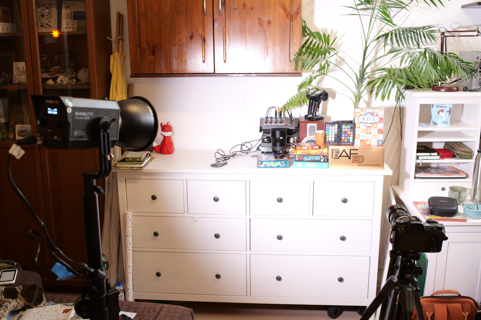
This is trivially obvious for the first component, the light source: find a cheap, used, middle class studio light, and experiment with it. You could also use a reporter’s flash. Or a flashlight taped to a broomstick. Or just use the windows you have in your flat, and consciously place your scenes and portraits relative to that source. Block part of the window with cardboard, try again…
Playing with the light sources is fun, very artistic - and cheap.
For my experiments below, however, no arts: I used a Nanlite Forza 150B, set exactly to a color temperature of 5000 or 6000 Kelvin and an intensity of 100%. It was placed at about 2m distance to the scene.
I also involuntarily included some orange-red colored christmas decoration - which I noticed only in post processing. I was unaware of it at the time of shooting, and although it has much lower intensity than the main light, it slightly tinged my results.
Gear I: Camera
Confession: the occasion which triggered my test was a gear acquisition event. I have recently sold all my Fujifilm gear for a para-disappointing price (see above), just enough to advance on the video side of hybrid cameras. This blog is evidence that I have a foible for videography. All the checks of ad-driven gear acquisition are checked, and though I can rationalize the purchase for myself, it still qualifies as an unnecessary, pleasant subduction to the dark side.
At any rate, the Panasonic Lumix S5II X is my first non-Nikon full frame camera. Flashback: I had started Fuji, then went full frame with a battered, second hand Nikon D610; Maja owns a great (second hand) Nikon D850, which heavily influenced my path to Nikon. And for photos, I was already most content with the Nikon Z7II which I purchased as a treat to myself upon finishing my PhD.
So these are the cameras used in the test below:
- Lumix S5II X | mirrorless | 24.2 Mp | base ISO 100
- Nikon D610 | DSLR | 24 Mp | base ISO 100
- Nikon D850 | DSLR | 45.7 Mp | base ISO 64
- Nikon Z7 II | mirrorless | 45.7 Mp | base ISO 64
The ISO values I list are base ISO, i.e. the lowest possible value within the “native” ISO range (which determines image noise). I linked a rather technical camera comparison website, DxOMark, who also evaluate “color depth” and “dynamic range” under lab condition. To re-iterate: I do not suggest that these tech specs should be relevant in an elevated way for camera purchase decisions.
There are a few research questions following from the available test items.
(i) Photo cell size and image exposure: All cameras are “full frame”, i.e. the camera sensor has a physical extent of approximately 36x24 mm. The higher number of megapixels on D850 and Z7 are packed in the same area, and thus cover a smaller surface area per individual pixel. Do the larger area pixels of the 24 Mp cameras lead to better exposure, or better color rendition?
(ii) Does lower base ISO lead to better “noise performance”, i.e. lower pixel noise? I did not specifically test this hypothesis, but just assume it to be true because that is what photography courses and tutorials teach you: the higher the ISO, the more noise, so best keep it low.
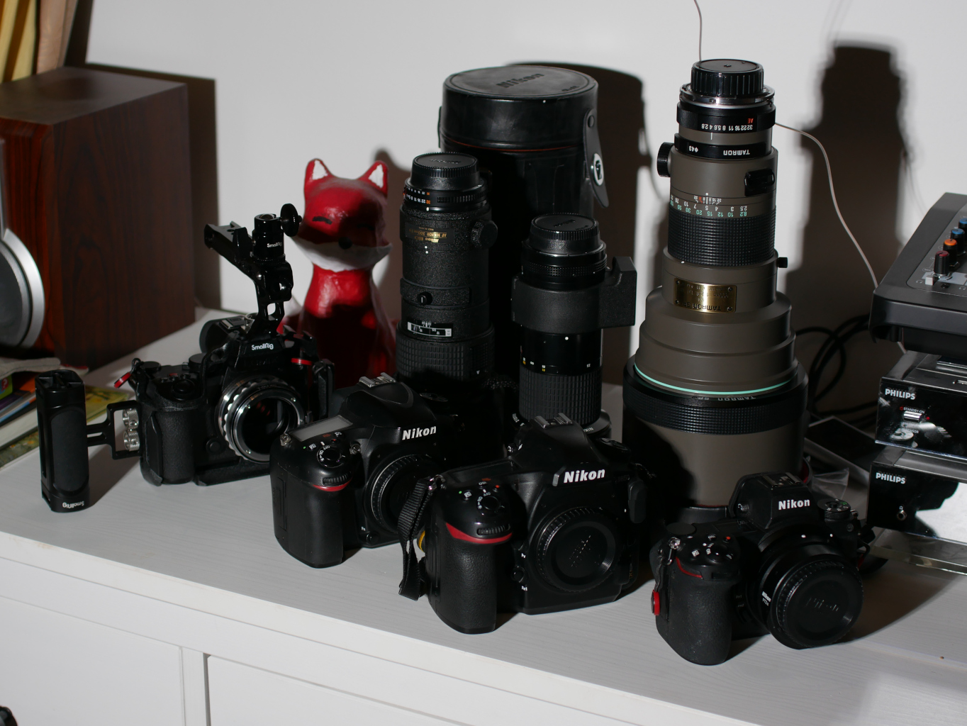
Gear II: Lens
My first telephoto prime purchase, the good old Tamron SP 300mm f/2.8 (1984), was still from the period when I thought that a large maximum aperture was the only critical characteristic for a good lens. It was heavy and impractical, and my personal copy had signs of internal degradation from moisture or fungus, causing haze.
Along came a cheap, old, second hand Nikon AI Nikkor 300mm f/4.5 (1978); much lighter, but a little darker.
Triggered by the excellent experience with a 180mm prime of the same series, I also jumped for a good occasion of a Nikon AF Nikkor 300mm f/4 (1987). Given the two other lenses, this seems to be a totally redundant purchase. I hoped for an edge of image quality, but found ex post that usability was much superior to the other two (as I will elaborate below). It also has autofocus, working flawlessly on the D850 and D610, but I do not care3.
Finally, I have access to a modern zoom lens which includes the 300mm range: the Sigma 150-600mm f/5-6.3 “C” (2014).
Three of the lenses are good old primes, two of those Nikon, one of those with autofocus, and the fourth is a modern autofocus zoom. Possible characteristic comparison should focus on these differences, on the comparison between “budget” (Tamron) and “high-end” (Nikkor), and differences in maximum aperture.
In case of the Panasonic camera, I used a cheap K&F adapter which can control the aperture, but has no electronic coupling or autofocus capability. Due to a technical mistake, I repeated the experiment with all four cameras and the Cosina Zeiss Milvus Apo Sonnar T* 135mm f/2.0 (2016) for a decisive, final comparison.
Color Checker
A considerable number of influential parameters in the photography signal chain can be fixed by the studio lighting, the camera, standard lenses. The object properties (color, reflectiveness, form and structure) also determine the photographic outcome.
I chose to use a passport-sized color checker by “calbrite”. This object contains a planar arrangement of squares in different colors, among which several shades of gray and a set of colors of varying hue and saturation.
Not the thing I would usually photograph. But totally appropriate for the present test. I added some games and toys to fancy up the scene, but cropped them out afterwards.
Photo Settings and File Storage
Focus was found manually on each photo, using focus highlight point and zoom to get it right. Exposure was entirely manual and identical for comparisons of photos (default: shutter speed 1/160 s, aperture f/5.6, ISO 100). White balance was fixed to the Kelvins set on the 4.1 (neglecting the christmas decoration). Standard color profile was chosen.
I intended to get raw and jpg storage options. However, on comparison of the 300mm lenses, I forgot one (“raw” on D610) or the other (“jpg” on D850). This prohibited some cross comparisons, which I will not discuss further. The extra test on a 135mm lens on the full set of cameras and file types makes up for my clumsy failure.
Results
Camera Fingerprints - Implicit Color Profiles
Because of the mistake in storage option selection for the 300mm lenses, I was drawn to comparing jpg results first. I rotated and cropped the scene to approximately the same perspective.
Before reading further, please take a moment to study the following tabular image comparison.
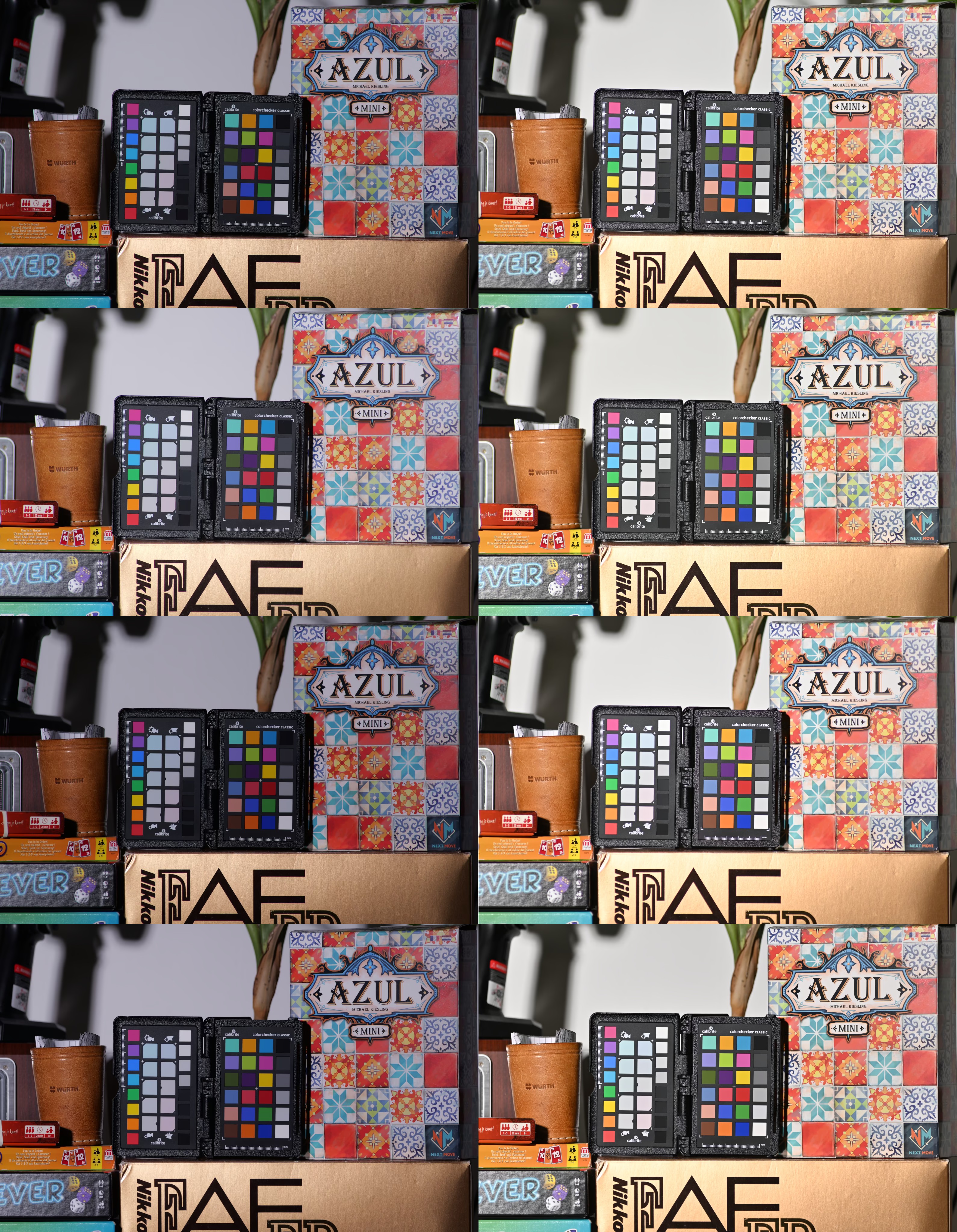
On this grid, lenses are in the order, top to bottom:
- Nikkor AF 300mm f/4.0 ED IF,
- Tamron 300mm f/2.8,
- Nikkor MF 300mm f/4.5 ED IF, and
- Sigma 150-600mm f/5-6.3 DG Contemporary at 300mm;
all were stopped down to f/5.6.
Cameras, in columns, are the S5II X (left) and the Z7 II (right).
Differences between lenses (rows) are subtle. The Tamron (second row) was a cheap purchase due to internal “fungus”, which manifests in typical haze (reduced contrast and increased lightness). Neither of the other lenses stands out in any way.
On the other dimension, the difference between cameras is striking. The Panasonic Lumix S5II X is notably darker on every lens, the gold packaging in the bottom part of the frame turned bronze. On the Nikon side, contrasts seem less punchy, and white balance is slightly red-shifted (ho, ho, ho).
As I will show, this difference in the jpg output is in part due to camera/sensor characteristics, and in part an issue of in-camera post processing (color profile). At this point, looking at the output files, we cannot distinguish. Take home message: camera companies have different recipes for baking their jpg files. Those are implicit color profiles, which demand correction for a fair comparison.
Color-Neutral Post Processing
Two important prerequisites for fair comparison: (1) Environmental color temperature should be fixed and known to avoid introducing false white balance. This was achieved by using a studio light. One could also use gray calibration fields of reference objects. Or maybe it does not matter, as long as photos to be compared are post-processed with identical WB. (2) Photos must actually be stored in raw files (which, embarrassingly, I forgot for the D610).
To get to bottom of the color differences, a raw file editor is required. I use rawtherapee.
Any such software also applies a number of processing steps by default. It has to, just to make a wide range of images moderately convenient to look at. The software is not even camera model agnostic. I manually de-activate all manipulation steps, except for:
- demosaicing (“fast”, with border of 7 pixels, but no “false color reduction”)
- white balance (set to the value of the studio light)
- optional rotation and cropping to the color checker box
If you like, you can download this minimal processing profile for rawtherapee here.
I was astonished by how many other ticks are checked by default (lens undistortion, exposure, de-noising, capture sharpening, chromatic aberration removal). All of these make sense in a normal processing workflow. However, we need to get to the raw colors.
Behold: photos from three cameras, mounted to the back of the AF Nikkor 300mm f/4 at f/5.6.
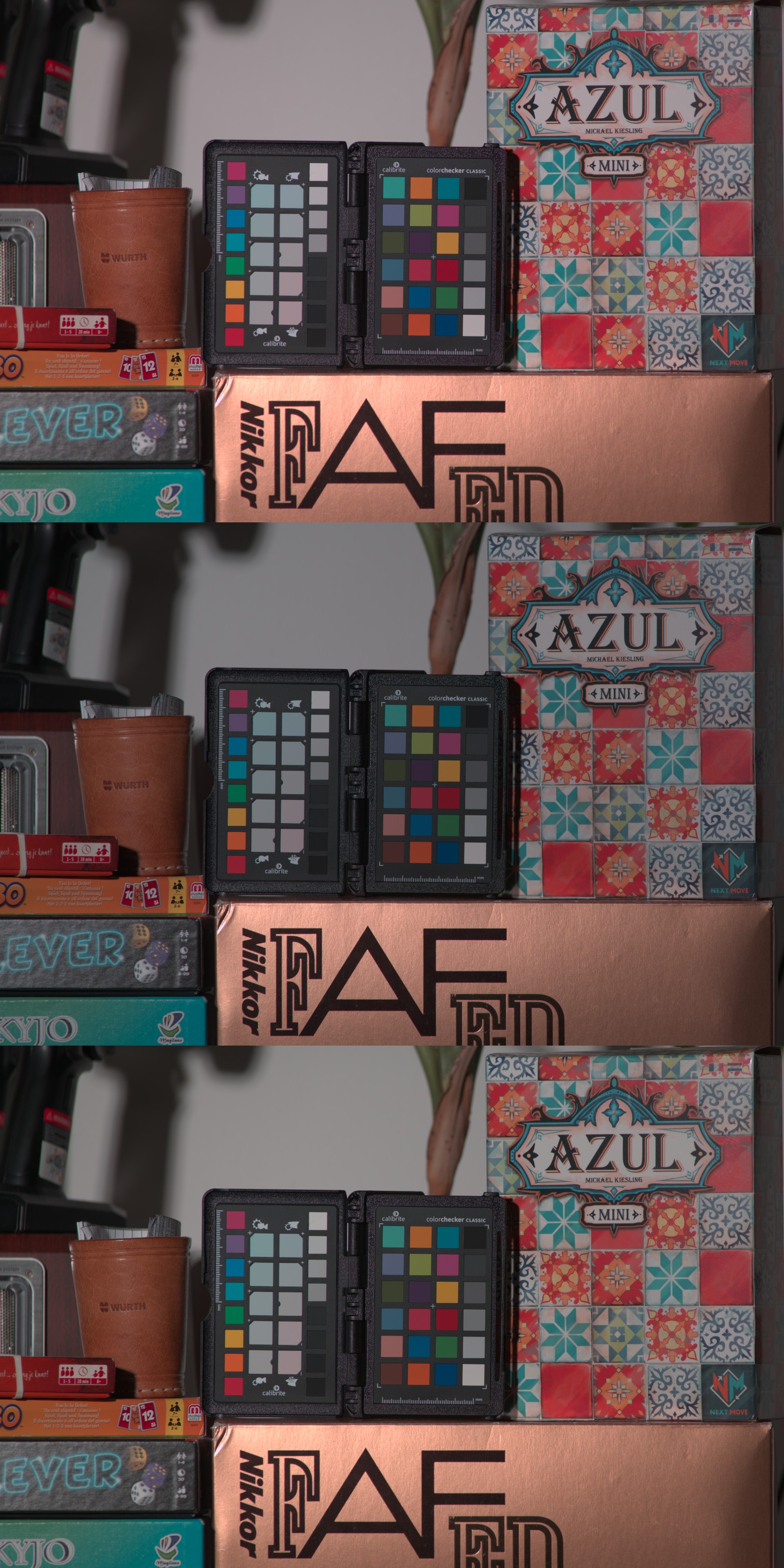
A first interesting point I noticed is that the histograms are generally shifted rightwards by postprocessing. On the camera jpg, the whole intensity range was filled, and the red channel was heavily clipping. In contrast, on the minimally processed raw, pixel intensities are restricted to slightly more than the left half of the available histogram range.
- The
D850(top image) shows a minor shift in saturation again, - The
S5II X(middle) is only slightly darker. - The
Z7 II(bottom image) is somewhere in between, very close to the others.
I personally found this quite a revelation. When rigorously controlling all lighting, exposure, and post processing steps, perceived image differences are negligible. At least for my own perception - which is the perception I arguably use the most.
High similarity implies that you can produce any desirable output from either of the cameras.
Color-neutral, minimal post processing serves as a baseline. Maybe they are a good tool to have a baseline for any raw photo processing workflow. With that out of the way, let us finally get quantitative.
Dynamic Range and Histograms
When looking at histograms of the same scene and swapping back and forth between images, I recognized some shifting characteristic peaks at different positions: taking Nikon as a reference, the central range of the Panasonic was wider, whereas the darkest and lightest parts of the images looked compressed. Of course, this impression was just a momentary record of my perception. One should rather extract the actual histograms and compare quantitatively. (Code available here.)
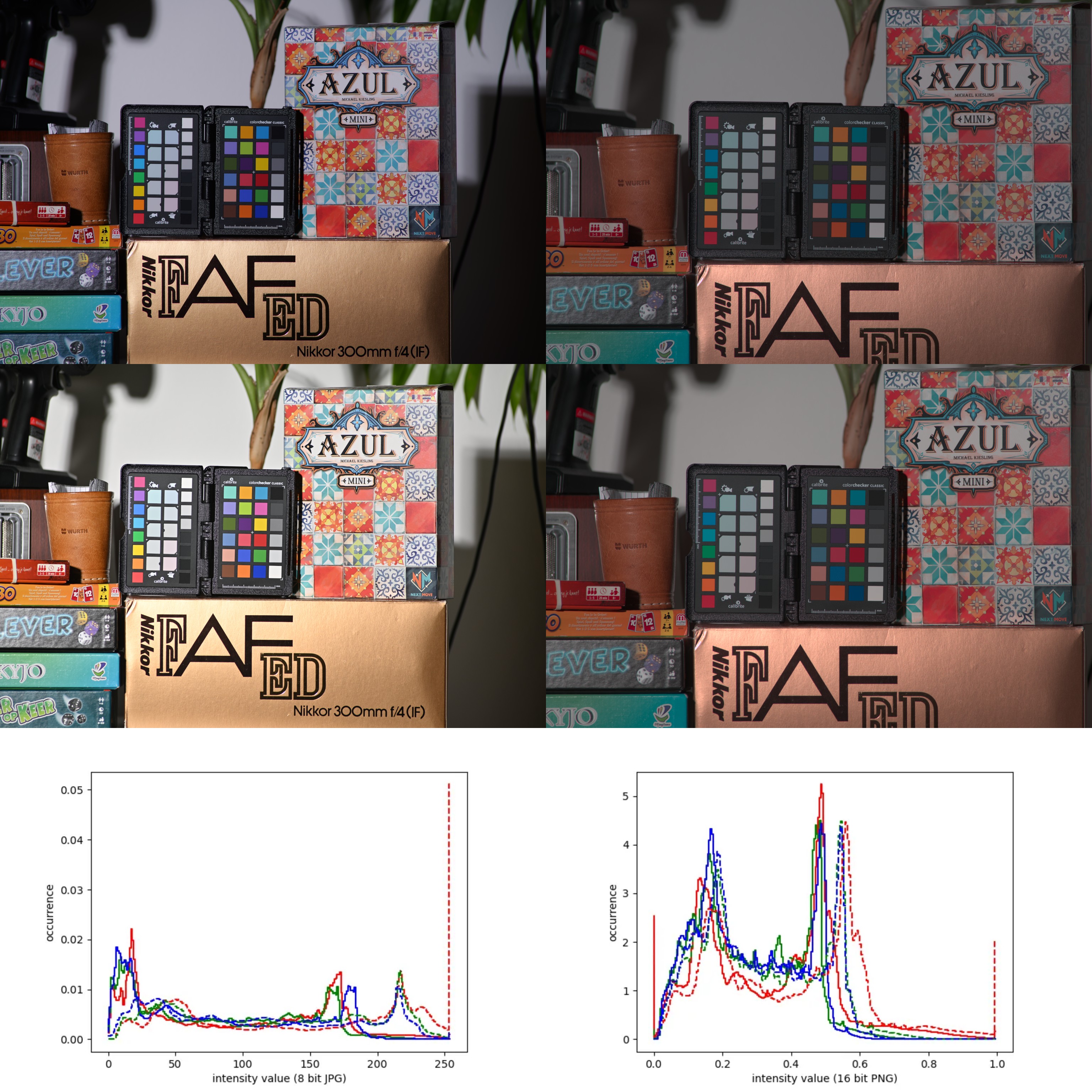
This figure shows four photographs, all taken with the 300mm AF Nikkor: on the left out-of-camera jpg versus on the right the rotated, cropped neutral raw exports to 16 bit png. The top row and the continuous line in the histograms were shot on the S5II X. The lower photo came from the Z7 II corresponding to dashed histogram lines, which show the intensity distribution for the Nikon. Histograms are computed individually per color channel, indicated by line colors (sorry to the color blind, it makes no sense to use other colors here). The differences between peaks of the color channels of the same photo actually relate to saturation.
The jpg of the Nikon photo seems generally lighter. Nikon even clips on the red channel (which influences the visible y range of the histogram). This is less of an issue in raw, though reds also clip on both ends of the histogram.
On the raw histogram, an interesting effect is visible. Generally, a similar shape of peaks and troughs (“mountain range”) is recognizable in all channels of both cameras. However, on the 24 Mp S5II X, the histogram is compressed to a narrower range of intensity values. The Z7 II spreads the occupied intensities of the scene over a wider range of lightness values. This is roughly consistent for all color channels.
The reason for this, and the consequences, are unclear to me.
It could be that the S5II X has a wider dynamic range: it captures a range from darker blacks to lighter whites, which is then crunched into the limited range of pixel intensities. In contrast, the Z7 II spans a narrower range of intensities (i.e. leftmost to rightmost intensity shown on the histogram), which is then spread out over the whole bit range.
Major spoiler: DxOMark lists a dynamic range of “14.5 Evs” and “14.7 Evs” for the two cameras. Dynamic range is not synonymous to the intensity values covered by a camera. Even more, there is no guarantee that the intensities captured in a raw file are a linear representation of grayscale.
Is the Nikon way of storing intensities better than the Lumix way? That depends. If you need a “wide dynamic range”, and your scene has both dark and light parts which you want to work on, then the narrower “mountain range” and far-reaching ends (assuming that they really reach far) might provide more post processing flexibility. But in all other cases, the wider “mountain range” provides better color resolution in the relevant levels of intensities.
None of this matters if you are capable of exposure bracketing…
Any turn of a control wheel will shift the histograms by stronger amounts than the differences in color-neutral raw exports found in this analysis. What might be relevant instead are noise ratios and patterns, which become emphasized by histogram-stretching operations (e.g. “Shadows and Highlights”).
Noise is influenced by ISO, and there is a difference in base ISO between the cameras, which co-incides with megapixel count.
As explained above, the two cameras differ fundamentally in “pixel area”.
The Z7 II sensor takes 45441024 pixel images on \(858 mm^2\), about \(18.9 \mu m^2\) per pixel (reference).
The S5II X sensor takes 24000000 pixel images on \(847 mm^2\), about \(35.3 \mu m^2\) per pixel (reference).
Light intensity is normalized by area, but the electric signal on the sensor should be comparable to a bucket (photo cell) which is filled with raindrops (photons): the bigger the area, the more water volume (image brightness).
Why does the Lumix not produce visibly brighter images at identical aperture and shutter settings?
I think the reason lies in a misinterpretation of the ISO. We commonly link it to noise, and try to keep it as low as possible. However, the definition of ISO (Wikipedia) is different: ISO quantifies the relationship between exposure and output image lightness in digital cameras. ISO clamps the image lightness, the image is rather far on the signal chain, thus this standardizes lightness after all specificities of the photo cell were already factored in.
The fact that the histograms of raw files from the S5II X and the Z7 II are offset nonetheless indicates some inaccuracy of the ISO standards or their implementation by different camera manufacturers.
To summarize: it is worth comparing raw histograms to learn about the capabilities and limitations of your gear (e.g. how they interpret “ISO”). In the controlled test case, clear differences are visible between the 45 Mp Nikon and the 24 Mp Panasonic cameras. Probably, none of these differences are of practical relevance when working with 14 bit raw files.
Quantitative Color Comparison
To round things off, I used another python script. It requires the input coordinates of the corner squares on the color checker matrix, to catch all the squares in between. I repeated my photography session with the best lens I had (second hand Milvus 135mm), went a bit closer, still forgot to turn off that damn christmas decoration :/
Here the selected and numbered squares superimposed on the raw image, exemplary for the D610:
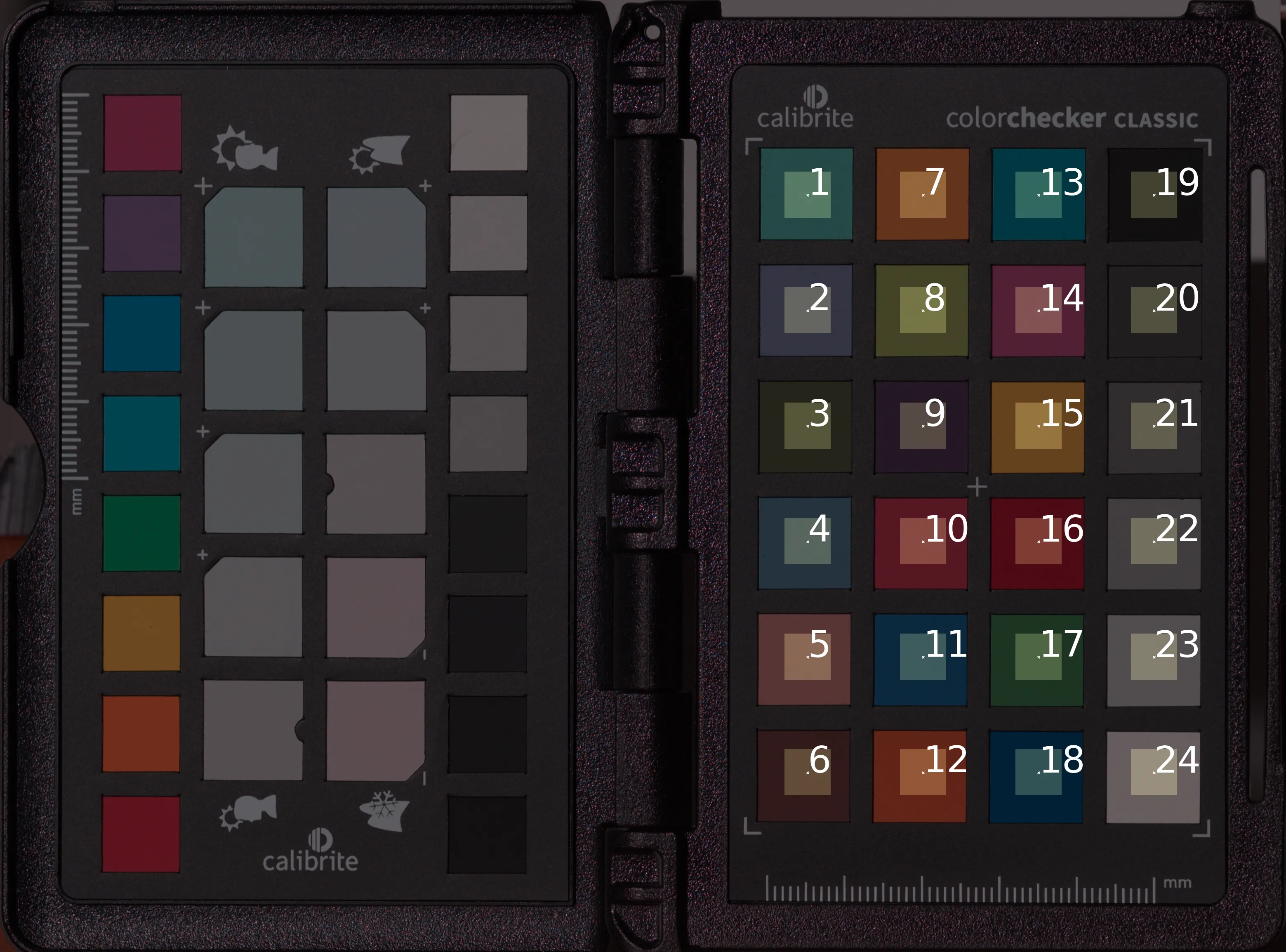
The script converts the image to HSV space using scikit-image. It then masks the individual squares which are arranged in a regular grid, extracts HSV for the center part, and stores the HSV averages. This is repeated for all four cameras.
HSV of the squares can then be plotted in a V-S diagram. Hue (coding mostly for the color) is of minor interest for the current test, though color accuracy of the cameras would be worth an investigation. I decided to plot V (“value”) against S (saturation).
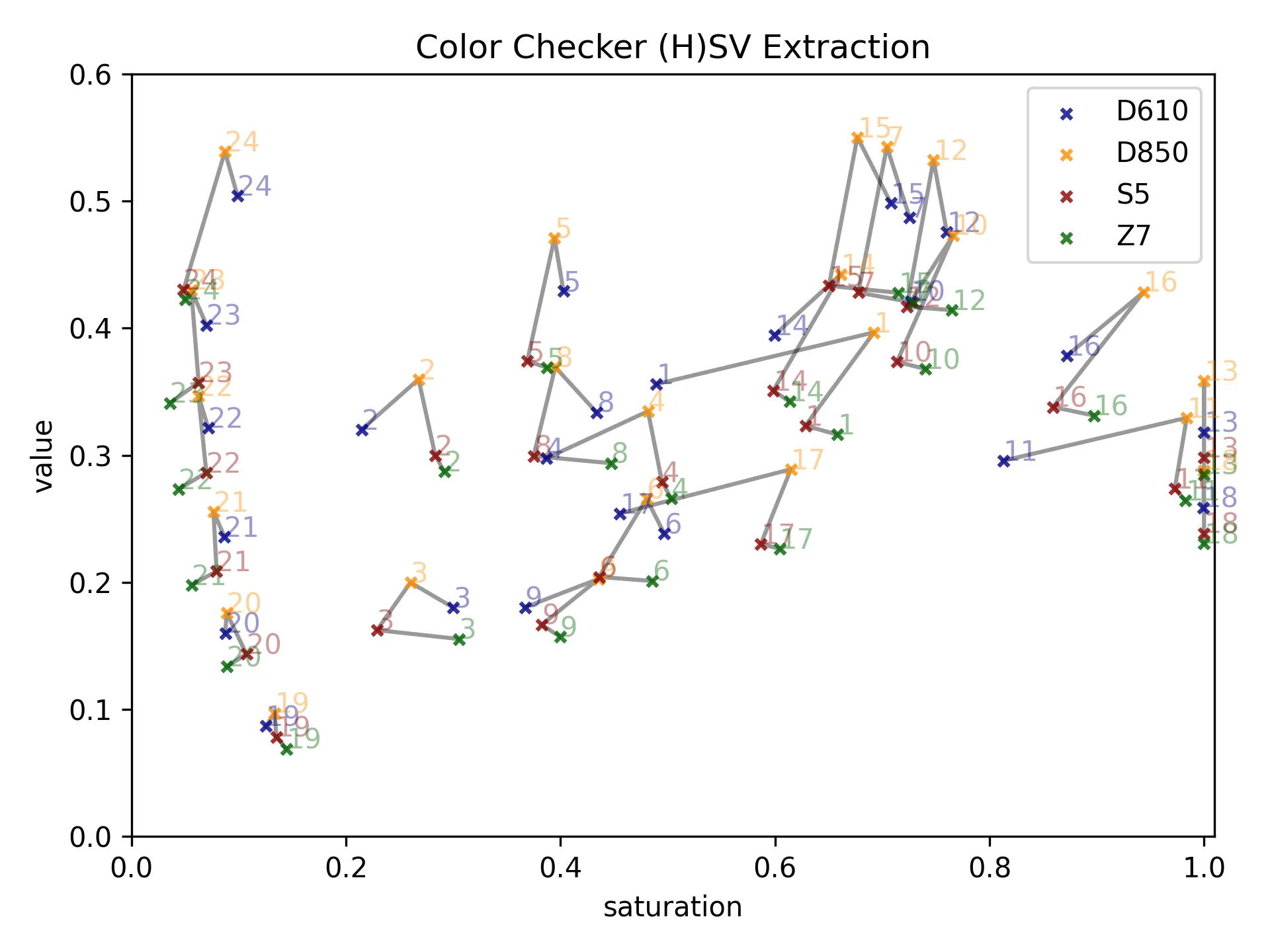
The higher up on the V-axis, the higher the average brightness of a square, from black to white. The further right a point, the more saturated the colors. For example, the gray references form a vertical, curved series on the left of the plot: black at the bottom, white on top. Measurements of the four cameras are connected by gray lines to facilitate comparison. Observations:
- Some color squares (13, 18) are oversaturated: their saturation values fall on the upper value range limit, despite low exposure.
- The D850 seems to be consistently more sensitive to light - even compared to the Z7, its spiritual mirrorless successor with a similar sensor. Nice camera. Pity it is the only one I do not own :/
- By far the least expensive of the four, the self-repaired D6104, is close to the others (except for three color squares which are off: 1, 11, 17).
- Generally, there is no consistent offset between megapixel classes. Neither is there a consistent advantage or disadvantage of mirrorless cameras in terms of color representation.
To put these findings into perspective: I could push all those measurements out of scale with a few clicks of my control wheels. For all practical purposes, it turns out that neutral color processing can neutralize all the differences between camera brands.
Exact values are exported here, for reference. My webspace is too valuable for storing the raw files, but in principle I would share them upon request, while politely recommending you take your own.
Underestimated Usability
When handling the different cameras and lenses, I was reminded of another key factor which is widely undervalued in camera equipment reviews: usability.
Take, for example, the 300mm prime lenses, each cost me less than 300EUR used. The AF Nikkor f/4.0 is by far the best of the three. It is between the other two in terms of maximum aperture (2.8/4.0/4.5). There is no major difference in color rendition: all have rather few elements, and render above average. Yet this lens handles notably better, for several reasons.
- Focus control: the focus ring turns accurately. It has sufficient focus throw, can be set accurately, and stays in place (moderate resistance). In contrast, the focus mechanism of the f/2.8 is too resistant and sticky, whereas the ring control of the f/4.5 turns too lightly and the focus throw is too short.
- Weight: it is much lighter than the f/2.8, and only slightly heavier than the f/4.5.
- Focus limiter and drop-in filters are great bonus features.
The same goes for cameras. The Lumix S5II X stands out with respect to usability. The menu is well structured, settings can be found and managed easily. Buttons are in intuitive places. The ISO button has little haptic indicators much like the home row markers on a keyboard - it can be found back without looking. Though the Nikon works just as reliably, and I have more practice on that system, I have the feeling that its usability is impeded by historic conventions (e.g. ISO knob press + control wheel turn), whereas Panasonic had the chance for a fresh and well thought-through design.
Taking the findings above into consideration, it is clear that usability and controlability of photographic devices deserve more attention. They are even harder to assess quantitatively. And personal preference matters much. Hence, the best advice is to try any gear you targeted, in person and with your own hands, before reaching for the credit card.
And be content with the gear you have: you are used to it, which makes it the most usable set you can get.
I also have an ambivalent opinion on mobile phone photos. On one hand, they have tiny sensors and very invasive post processing algorithms; image resolution is overstated (no 50 Mp mobile phone camera can compete with my 45.7 Mp Nikon). There are options to take =raw= photos with mobiles, for example by using the Open Camera app. I tried this on occasions, but either bit depth is less than on a proper camera, or there is oversampling, lossy compression - I can only speculate why the images just do not look as good. But then, people are quite adept at using their phone, they understand the focusing quirks and exposure limitations. And in the end, any photo of a memorable family event is better than no photo.
So if you ask me: keep on doing your smartphone thing! I find it great that people all over the place are habituated to intrusive photography. The more smartphone photographers, the more effectively will my photos impress people. Just make sure to store your photos in a safe place, and definitely keep some order in your files.
Summary (TL;DR)
Modern marketing is perfidious. Starting clueless, we read review texts or watch handsome tech experts, hoping for advice on a significant purchase. We receive bullshit bingo, emotional barrage, ruthless gaslighting. Still, or maybe exactly for that reason, we mechanically keep repeating the cycle.
Once you start down the dark path, forever will it dominate your destiny. (Yoda, The Empire Strikes Back)
Condense down my wisdom now, I will.
- Though buying second hand is recommendable, re-selling gear is rarely profitable. The second hand camera gear market is skewed.
- The photography signal chain is a useful concept to evaluate consequences of settings you choose. But make sure to control all chain segments.
- Each camera brand has their specific way of turning
rawintojpg. Take responsibility and learn to processrawin post. - … because with raw processing mastered, you can create any desired outcome with any modern digital camera. This implies that you do not need a new one.
- Color-neutral raw processing provides a standardized starting point for image analysis and processing.
- Histograms are a key tool to understand image colors and contrast. However, their “width” is not synonymous to “dynamic range”.
- ISO measures and standardizes the exact lightness of an image at a given exposure. This is quite a stretch along the signal chain, and manufacturers seem to interpret standards differently.
- HSV transformation and L-S-diagrams highlight differences between cameras. Differences are minor compared to exposure and saturation tweaks, and therefore of inferior practical relevance.
- Usability is an overlooked comparison criterion.
- Corollary: learn to expose right. This is priority.
There is more to find in the text and analyses above. The question of sensor size. The question of megapixels, photo cell size and base ISO with regard to noise. Haze is little of a problem; at first, photos look mushy, but you can get great contrast in post when you expose correctly. Bit depth matters (but 14 bit is great), which is more of a constraint for video. My tests were on fixed exposure parameters (1/160 s, f/5.6, ISO 100); will other settings support the outcome? Questions, questions, questions. All exciting.
In this notebook, I assembled some boiled-down lessons from my personal adventures with photography equipment. I hope some of my “discoveries” provide impulses that set you out to explore for yourself.
Your questions, comments, feedback are most welcome, and I might append them below.
Enjoy taking photos!
-
The last point, questioning independence of a review, is a bonus tip. ↩︎
-
In electronics, but also in music, the signal chain is the series of all components which transmit or transduce an (electrical or acoustic) signal, thereby affecting it in more or less subtle ways. ↩︎
-
Using autofocus on photo cameras is just like using AI for coding. Much quicker, much more unreliable, and I would not want to take responsibility for it. ↩︎
-
When I bought it, the ceramic aperture value transducer plate was broken. I soldered in a spare part, also exchanged the prism for one with manual focus help. Dream camera. ↩︎