Rationale
I have written extensively about the algorithmic details of the variogram method. Since then, I had some chance to put those procedures into practice.
Among those chances was what might be a rather special corner case. (Or, who knows, maybe not, maybe this data situation is actually quite common.) I was busying myself with spatially distributed measurements of chemical concentration.
Soil chemistry. Phosphate. Nitrate. Ammonia. Measurements collected over the past fourty years across all of Flanders. Some of those measurements, particularly phosphate, are commonly (or, historically) quite low in the soil samples. On top of that, our measurement devices turn out to feature a lower detection limit, and therefore quantized values. This has the following consequences.
The minimum detectable value implies that concentrations below a certain minimum threshold turn out to be just that: below a threshold. Detection limit means that our instrument would show a value of, for example, \(0.05\), for any and all true concentrations of \(0.05\) or below. It would be incorrect to say that concentration was zero. It never is. It would be incorrect to set values to the lower detection limit, since that would inflate the measurement probability of that specific value. The same goes for any other value in between, say, half the detection limit. We do not know the true value.
But it is also incorrect to register that we know nothing, by discarding the measurement. At least we have assessed that a particular concentration, at a given place and time, was low. Neglecting that information would apply a form of “zero-deflation” on our outcome’s distribution.
Then, one level more complex, there is the issue of quantization. Quantization means that our measurement outcome is unavoidably rounded: for example, a quantization of \(0.05\) will result in values which are shifted to their closest multiple of \(0.05\) (i.e. \(0.05\), \(0.10\), \(0.15\), …). This is analogous to the lower detection limit, just that no one would have the intuitive the reflex to discard these values because they are off.
A subsequent issue is the application of a log transform: Concentrations often fall out on a log-normal distribution, which means that they are much more well-behaved if we transform them with any kind of logarithm function. Finally, the computation of variograms involves pair-wise differences, binning, and a Matérn regression, in that order.
This is why I experiment with the tools below. Here is my plan.
- create artificial, random, concentration-like data
- (optionally) quantize
- log-transform, compute difference
- compute variogram (binning, averaging, visualization; no Matérn regression necessary this time)
I am as excited as you are to find out what will happen.
import numpy as NP
import pandas as PD
import matplotlib as MP
import matplotlib.pyplot as PLT
from scipy import stats as SPSS
from scipy import spatial as SPAT
import seaborn as SB # for the final violin plot
I tangled a script which contains all the lines of code from this notebook, available here for download.
Data “Simulation”
distribution
I fix some global parameters for continuity with my previous tutorial…
n_observations = 2**13 # sample size
extent = 128 # width of the playing field
smooth_sigma = 4 # smoothing range for creating spatial inter-dependence via Gaussian convolution ("smoothing")
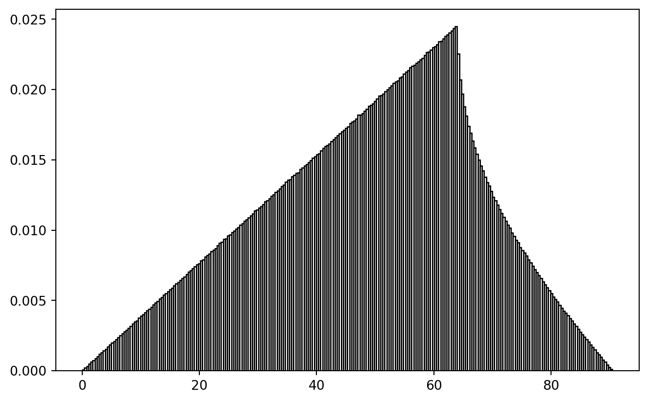
It would be useful if we first learned to sample from a log-normal distribution.
mu = NP.exp(-2)
sigma = 1.0

lnd = SPSS.lognorm(scale = mu, s = sigma)
x = NP.linspace(*lnd.interval(.999), 2**8)
y = lnd.rvs(size = n_observations)

fig, ax = PLT.subplots(1, 1)
ax.plot(x, lnd.pdf(x), label = "probability density function")
ax.hist(y, bins = x, density = True, label = "example histogram", fc = "w", ec = "k")
ax.set_xlim(0, lnd.interval(0.975)[1])
PLT.legend()
PLT.show()
!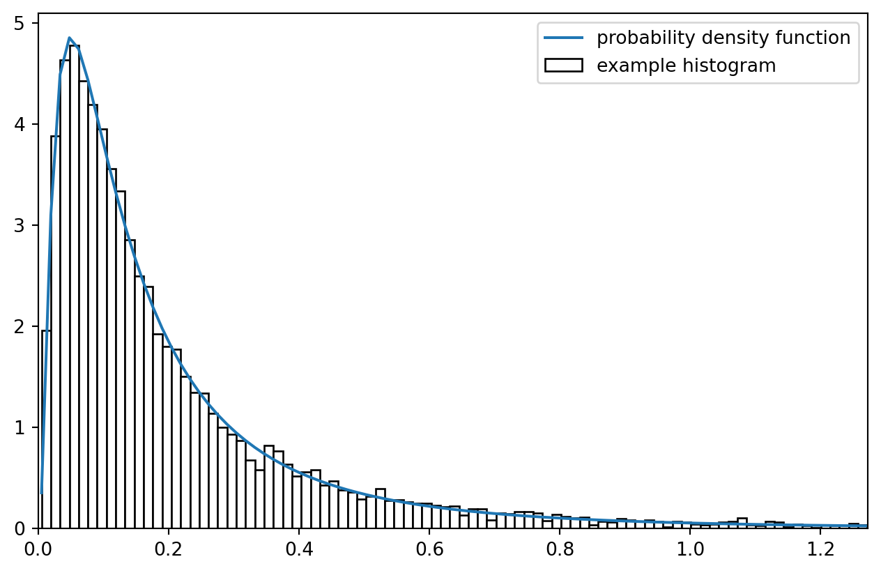
Imagine all the observation in histogram bins being fixed on the bin centers: what a coarse simplification! But that is approximately what we are after.
data
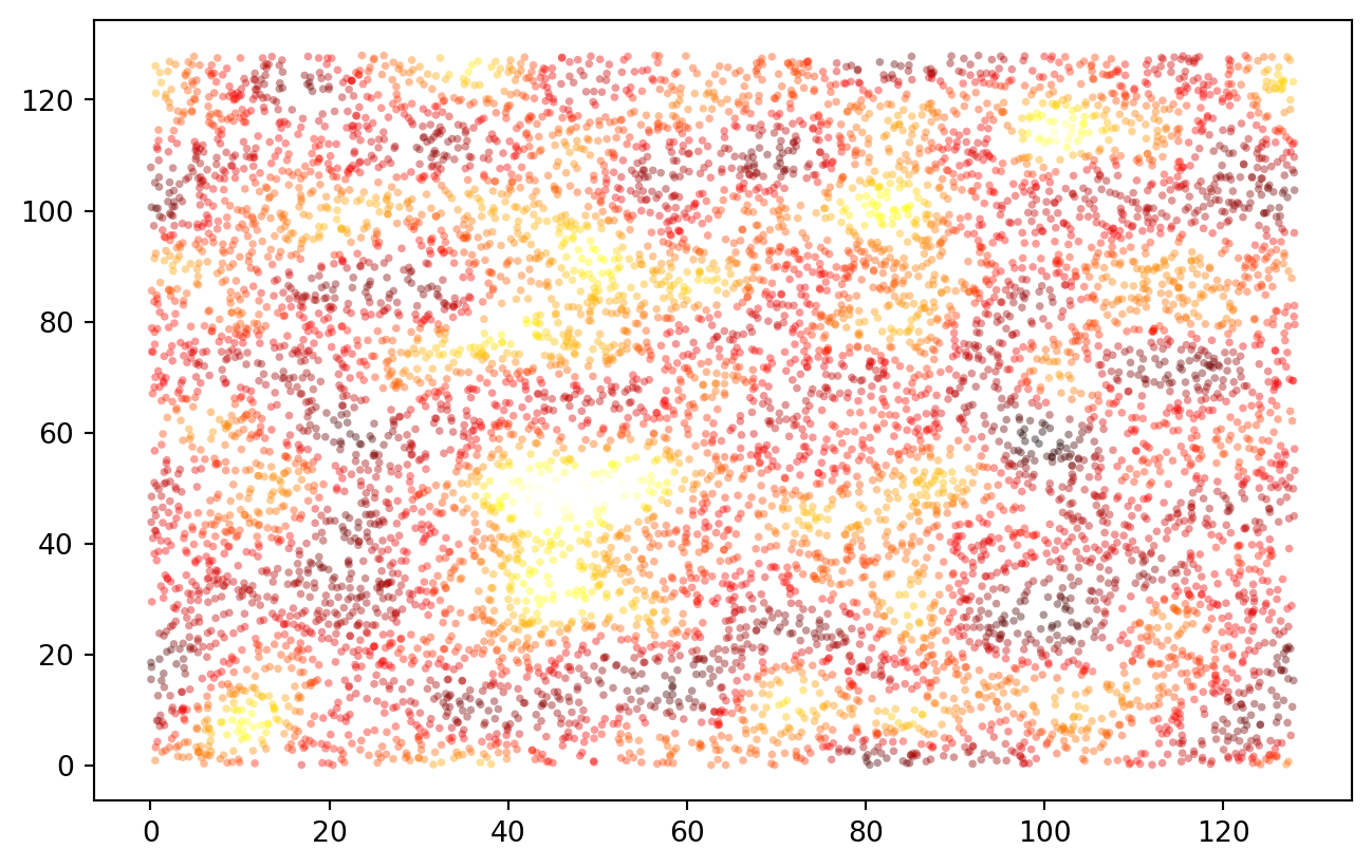
Measurement points are spatially distributed:
data = PD.DataFrame.from_dict({
    "x": SPSS.uniform(0, extent).rvs(size = n_observations),
    "y": SPSS.uniform(0, extent).rvs(size = n_observations),
    "z": SPSS.lognorm(scale = mu, s = sigma).rvs(size = n_observations)
})
data.index.name = "sample"

print(data.sample(5).to_markdown(floatfmt = ".4f"))
|   sample |        x |        y |      z |
|---------:|---------:|---------:|-------:|
|      558 | 106.9348 |  40.0853 | 0.6085 |
|     3293 |  35.8669 |  88.6921 | 0.1705 |
|     5430 | 126.1146 | 124.4765 | 0.2745 |
|     1047 |  36.3791 |  57.2293 | 0.0703 |
|     1290 | 119.7911 |   5.8552 | 0.2203 |
PLT.scatter(data["x"], data["y"], c = data["z"], s = 8, ec = "none", alpha = 0.4, cmap = "hot")
PLT.show()
!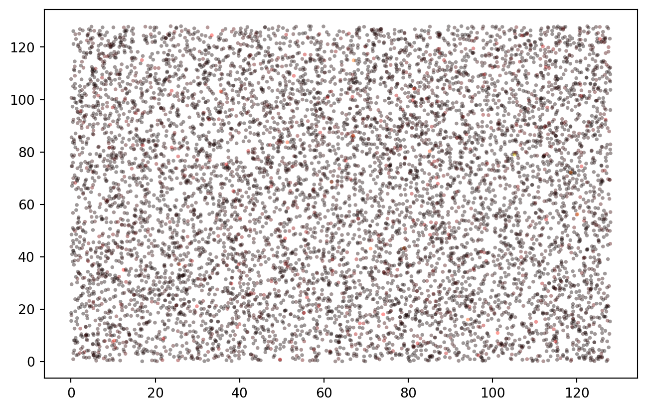
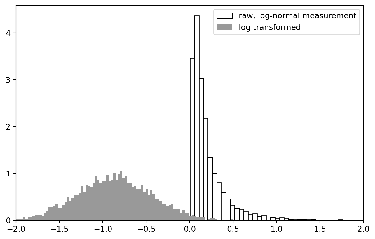
This basically works as in the R example, though in this completely random case there is no spatial correlation yet. At any rate, the data is beautifully log-normal.
PLT.hist(data["z"], bins = 2**7, ec = "k", fc = "w", density = True, label = "raw, log-normal measurement")
PLT.hist(NP.log10(data["z"]), bins = 2**7, ec = "None", fc = "0.6", density = True, label = "log transformed")
PLT.gca().set_xlim(-2, 2)
PLT.legend()
PLT.show()
!
cross-calculation functions
There are most certainly scipy functions to calculate cross-distance and apply a Gaussian blur. In Python / Numpy, those are based on the concept of “universal functions” (ufunc).
crossdifference_1d = lambda x1, x2: NP.subtract.outer(x1, x2)
selfdifference_1d = lambda x: crossdifference_1d(x, x)
crossdist_df = lambda df, cols = ["x", "y"]: NP.sqrt(NP.add(selfdifference_1d(df[cols[0]].values)**2, selfdifference_1d(df[cols[1]].values)**2))
lower_triangle = lambda x, k = 0: x[NP.tri(*x.shape, k = k, dtype = bool)]

test_data = data.iloc[:5, :]
test_distances = crossdist_df(test_data)
print(test_distances)

print(lower_triangle(test_distances, k = -1))
[[  0.           5.54109325  72.88841308  75.76261097  60.98053644]
 [  5.54109325   0.          67.5516257   79.55910639  58.65822776]
 [ 72.88841308  67.5516257    0.         126.5713582   84.61413927]
 [ 75.76261097  79.55910639 126.5713582    0.         135.65157274]
 [ 60.98053644  58.65822776  84.61413927 135.65157274   0.        ]]
[  5.54109325  72.88841308  67.5516257   75.76261097  79.55910639
 126.5713582   60.98053644  58.65822776  84.61413927 135.65157274]
Behold the actual distance distribution:
PLT.hist(lower_triangle(crossdist_df(data), k = -1), bins = 256,
    fc = "w", ec = "k", density = True )
PLT.show()
!
Philosophical Thought: If our true research question would be about a difference-distance-relationship, we better not use random spatial sampling to tackle it. Spatially balanced sampling would be equally wrong, because then cross-distance distribution would be biased. It seems to be a valid challenge to create a spatial sample which contains a uniform distribution of spatial cross-distances. (Problem squared if temporal differences play a role.)
wrapping
I just doubt whether my wrapping function on that other tutorial made sense.
In trying to reproduce it, I created a shark fin image! (Leaving it in here for the artistic value.)
selfdifference_1d_wrap = lambda x, ext = extent: (crossdifference_1d(x, x) + ext/2) % (ext) - ext/2
crossdist_df_wrap = lambda df, ext = extent, cols = ["x", "y"]: \
    NP.sqrt(NP.add(
        selfdifference_1d_wrap(df[cols[0]].values, ext)**2, selfdifference_1d_wrap(df[cols[1]].values, ext)**2
    ))


test_df = PD.DataFrame.from_dict({
    "x": [0., 0.4, 0.0, 1.],
    "y": [0., 0.0, 0.6, 1.]
})
# print(crossdist_1d_wrap(test_df["x"].values, ext = 1.))
print(crossdist_df_wrap(test_df, ext = 1.))

PLT.hist(lower_triangle(crossdist_df_wrap(data, ext = extent), k = -1), bins = 256,
    fc = "w", ec = "k", density = True )
PLT.show()
[[0.         0.4        0.4        0.        ]
 [0.4        0.         0.56568542 0.4       ]
 [0.4        0.56568542 0.         0.4       ]
 [0.         0.4        0.4        0.        ]]
!
At least the ramp-up is plausible: the larger inclusion radius, the more points to pair.
Gaussian Blur
We defined a smoothing sigma (“blur range”) in the very beginning. And we still have our fully random test data. Here, we introduce spatial non-independence.
Gauss-weights of the distances are calculated, multiplied with the values, then summed up and normalized.
# print(smooth_sigma)
# print(test_data)

gauss = SPSS.norm(0., smooth_sigma)
# x = NP.linspace(-2*smooth_sigma, 2*smooth_sigma, 129)
# PLT.plot(x, gauss.pdf(x))
# PLT.show()

weights = gauss.pdf(crossdist_df_wrap(test_data))
test_data["z*"] = NP.dot(weights, test_data["z"].values) / NP.sum(weights, axis = 1)
print(test_data)
                 x           y         z        z*
sample
0        48.936872   61.675294  0.109542  0.271226
1        54.469544   61.369924  0.693282  0.531598
2       120.271691   76.644071  0.876955  0.876955
3         1.690006  120.901191  0.065604  0.065604
4        73.745866    5.969463  0.511043  0.511043
And for the full data set:
trafo = lambda x: NP.log10(x)
trafo_inv = lambda x: 10**(x)
# trafo = lambda x: x

def spatial_blur_data(df, ext = extent, spatial_cols = ["x", "y"], measurement_col = "z"):
    df = df.copy()
    df["measure_transformed"] = trafo(df[measurement_col].values)
    weights = gauss.pdf(crossdist_df_wrap(df, ext = ext, cols = spatial_cols))
    blurred_measurement = NP.dot(weights, df["measure_transformed"].values) / NP.sum(weights, axis = 1)
    return(trafo_inv(blurred_measurement))

data["z*"] = spatial_blur_data(data, ext = extent)

PLT.scatter(data["x"], data["y"], c = data["z*"], s = 8, ec = "none", alpha = 0.4, cmap = "hot")
PLT.show()
!
Are we still log-normal?
trafo = lambda x: x

PLT.hist(trafo(data["z"].values), bins = 2**9, ec = "k", fc = "w", density = True, alpha = 0.4, zorder = 2, label = "raw measurement")
PLT.hist(trafo(data["z*"].values), bins = 2**6, ec = "none", fc = "darkblue", density = True, alpha = 0.6, zorder = 1, label = "spatial non-independence simulated")
PLT.gca().set_xlim(0, 1.)
PLT.legend()
PLT.show()
!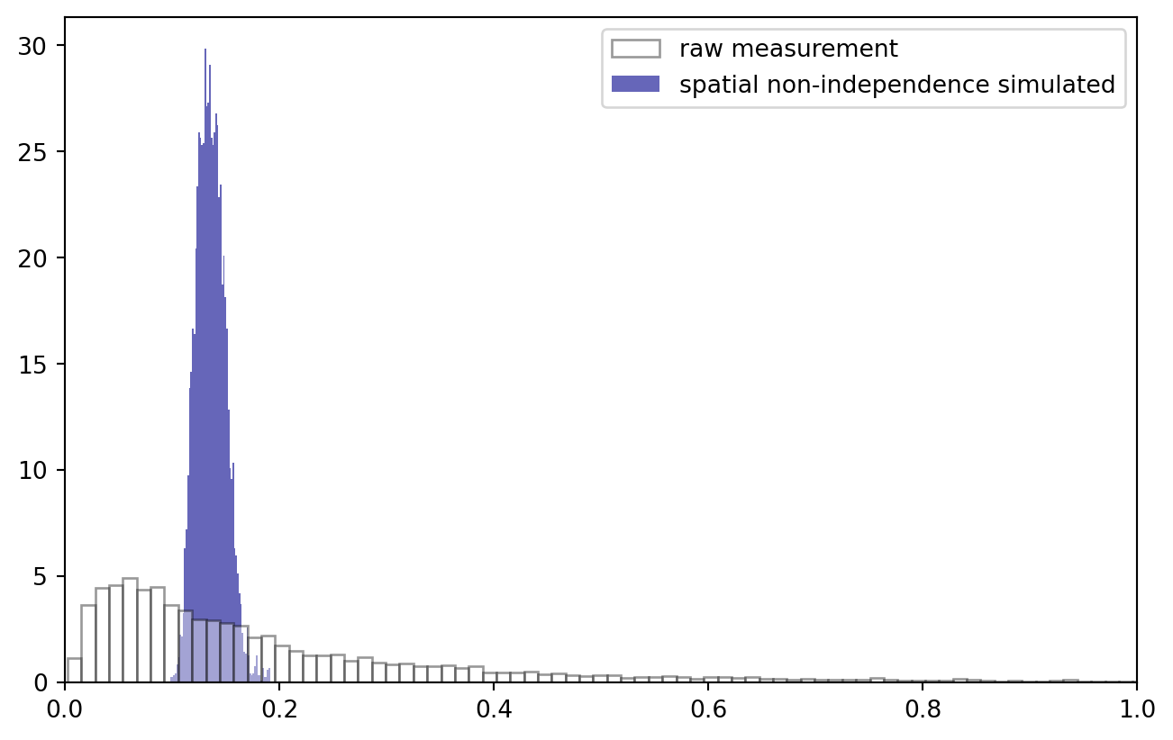
No surprise that the data distribution changed: we now observe a much narrower band of values. Log transformation stays an option: note how, to keep everything nice and in order, I applied the Gauss convolution in log space and inverted the transformation afterwards.
quantization
Quantization has to happen after introducing non-independence: in the real world, concentrations are a natural, quasi-continuous measurement (although strictly, when analyzing small molecular quantities, that is not true). Spatial correlation stems from common, local factors. The quantization filter introduced by our measurements follows at the end of the data acquisition chain.
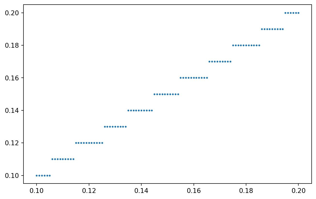
def quantize_values(vals, resolution):
    # using "ceiling" to simulate the lower limit has a funky effect, try it yourself!
    # vals = NP.ceil(vals / resolution) * resolution

    # ... I rather use the "round"
    vals = NP.round(vals / resolution, 0) * resolution

    return(vals)

x = NP.linspace(0.1, 0.2, 101)
y = quantize_values(x, resolution = 0.01)

PLT.scatter(x, y, s = 3)
PLT.show()
!
Quantizing our spatially coupled concentration measurements:
data["zq"] = quantize_values(data["z*"].values, resolution = 0.005)

PLT.scatter(data["z*"], data["zq"], s = 3)
PLT.gca().set_xlabel("actual physical value")
PLT.gca().set_ylabel("inaccurate measurement")
PLT.show()
!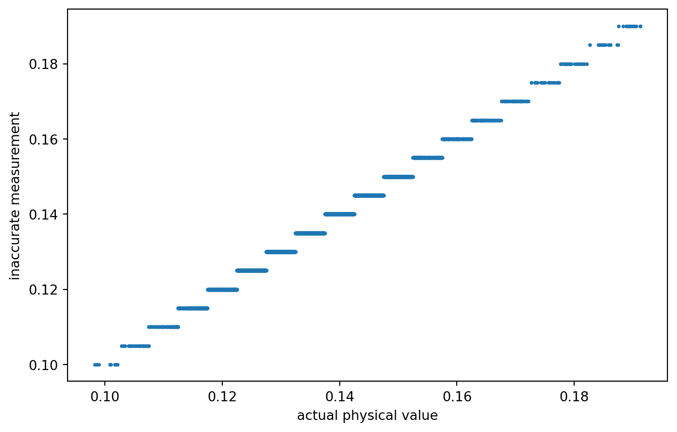
A rather coarse quantization. Or not? What quantization would actually be realistic?
Anyways, data is prepared! Our inaccurately measured variable is labeled zq, the true / actual value is z*. Time for variogram analysis.
Analysis
distance calculation
Of course, for all possible pairs of observations, we want to calculate their distance.
quick_lt = lambda mat: lower_triangle(mat, k = -1)
distances = quick_lt(crossdist_df_wrap(test_data))
print(distances)
[ 5.54109325 58.60893251 64.04586225 75.76261097 79.55910639 45.24817509
 60.98053644 58.65822776 73.82989176 57.45020863]
Those are useful - unless we loose which observation were used to calculate the distance.
idx_matrix = lambda n: NP.repeat(
    NP.arange(n).reshape(-1, 1),
    repeats = n,
    axis = 1
)
idx1 = quick_lt(idx_matrix(test_data.shape[0]))
idx2 = quick_lt(idx_matrix(test_data.shape[0]).T)

test_diff_df = PD.DataFrame.from_dict({
    "idx1": quick_lt(idx_matrix(test_data.shape[0])),
    "idx2": quick_lt(idx_matrix(test_data.shape[0]).T),
    "dist": quick_lt(crossdist_df_wrap(test_data))
})

print(test_diff_df)
   idx1  idx2       dist
0     1     0   5.541093
1     2     0  58.608933
2     2     1  64.045862
3     3     0  75.762611
4     3     1  79.559106
5     3     2  45.248175
6     4     0  60.980536
7     4     1  58.658228
8     4     2  73.829892
9     4     3  57.450209
And for the real data:
diff_data = PD.DataFrame.from_dict({
    "idx1": quick_lt(idx_matrix(data.shape[0])),
    "idx2": quick_lt(idx_matrix(data.shape[0]).T),
    "dist": quick_lt(crossdist_df_wrap(data))
})
data transformation and difference measure
Two difference values are required: the real one and the quantized one. We simply compute mean absolute difference of log values.
# z = NP.log10(test_data["z*"].values)
# dz = NP.abs(selfdifference_1d(z))
# print(dz)

compute_diff = lambda vals, trafo: \
    quick_lt(NP.abs(
        selfdifference_1d(trafo(vals))
    ))


diff_data["dz*"] = compute_diff(data["z*"].values, trafo = NP.log10)
diff_data["dzq"] = compute_diff(data["zq"].values, trafo = NP.log10)

print(diff_data.sample(5))
          idx1  idx2       dist       dz*       dzq
25722274  7172  7068  65.824248  0.042999  0.042752
14333912  5354  3931  61.523824  0.031363  0.032185
26290360  7251  5485  59.207346  0.061538  0.064458
20042132  6331  4517  40.671149  0.050014  0.044204
18053051  6009  2015  35.441204  0.062446  0.064458
distance binning
The next step is to put the observations into meaningful distance bins.
This involves sorting, thus is a good occasion to express gratefulness to Sir Tony Hoare, the inventor of quicksort, who recently passed away.
The algorithm implemented in numpy is so efficient that I can sort back and forth the massive array of cross-calculated distances. What an insane achievement. Kudos to all the devs who worked a long way to enable me to do this on my flashy steam deck!
And although you can confirm yourself that binning really works on the whole “simulated” data set in a few seconds, I will filter for the relevant distances to reduce computer load a bit.
print("all data:", diff_data.shape[0])
max_dist = extent / 4
diff_data = diff_data.loc[diff_data["dist"].values < max_dist, :]
print(f"distance filtered to {max_dist}:", diff_data.shape[0])
all data: 33550336
distance filtered to 32.0: 6594552
Now, assigning distance bins to the measurement values:
# vals, bin_size = diff_data["dist"].values, 10000

def sort_into_equibins(vals, bin_size):

    n = len(vals)
    n_bins = (n // bin_size)
    indices = NP.arange(n)
    sort_idx = NP.argsort(vals)
    idx_sorted = indices[sort_idx]
    vals_sorted = vals[sort_idx]

    bin_idx = NP.array(NP.floor(indices / n_bins), dtype = int)

    bin_new = NP.empty(n)
    bin_new[sort_idx] = bin_idx
    # print(bin_new)

    return(NP.array(bin_new, dtype = int))


# test_vec = NP.random.choice(NP.linspace(0, 100, 101), 100, replace = False)
# test_vec = PD.DataFrame.from_dict({
#     "val": test_vec, "idx": sort_into_equibins(test_vec, 10)
# })
# print(test_vec.sort_values("val"))

diff_data["dist_bin"] = sort_into_equibins(diff_data["dist"].values, 100)

print(diff_data.head(5))
    idx1  idx2       dist       dz*       dzq  dist_bin
0      1     0   5.541093  0.033152  0.032185         3
14     5     4  23.402105  0.119251  0.120574        53
25     7     4  15.537166  0.015355  0.017033        23
27     7     6  31.070526  0.044367  0.047425        94
32     8     4  29.121558  0.017652  0.017729        82
Double check that we really have approximately equal bin sizes:
bin_counts = diff_data.groupby("dist_bin").size()
print(bin_counts)
dist_bin
0      65945
1      65945
2      65945
3      65945
4      65945
       ...
96     65945
97     65945
98     65945
99     65945
100       52
Length: 101, dtype: int64
visualization
The final step is a group-apply.
def variogram_analysis_prep(diff_df):
    grouped_diff_df = diff_df.groupby("dist_bin").agg(
        {
            "dist": [NP.mean],
            "dz*": [NP.mean, NP.var],
            "dzq": [NP.mean, NP.var]
         }
    )

    return(grouped_diff_df)


grouped_diff_data = variogram_analysis_prep(diff_data)
print(grouped_diff_data)
               dist       dz*                 dzq
               mean      mean       var      mean       var
dist_bin
0          2.135587  0.013065  0.000124  0.013069  0.000168
1          3.899984  0.023309  0.000307  0.023346  0.000349
2          5.043704  0.029498  0.000477  0.029587  0.000520
3          5.975839  0.033675  0.000623  0.033701  0.000666
4          6.777436  0.037240  0.000760  0.037276  0.000805
...             ...       ...       ...       ...       ...
96        31.435484  0.051142  0.001539  0.051217  0.001586
97        31.597608  0.050625  0.001506  0.050653  0.001555
98        31.758973  0.050874  0.001507  0.050915  0.001553
99        31.920006  0.050951  0.001521  0.051024  0.001571
100       31.999933  0.047500  0.001867  0.047246  0.001782

[101 rows x 5 columns]
gddata = grouped_diff_data.iloc[:-1, :]
PLT.plot(
    gddata[("dist","mean")].values,
    gddata[("dz*","mean")].values,
    color = "k",
    alpha = 0.8,
    zorder = 2,
    label = "using actual values"
)

PLT.scatter(
    gddata[("dist","mean")].values,
    gddata[("dzq","mean")].values,
    s = 10,
    color = "k",
    alpha = 0.6,
    zorder = 1,
    label = "using quantized measurements"
)

PLT.legend()
PLT.show()
!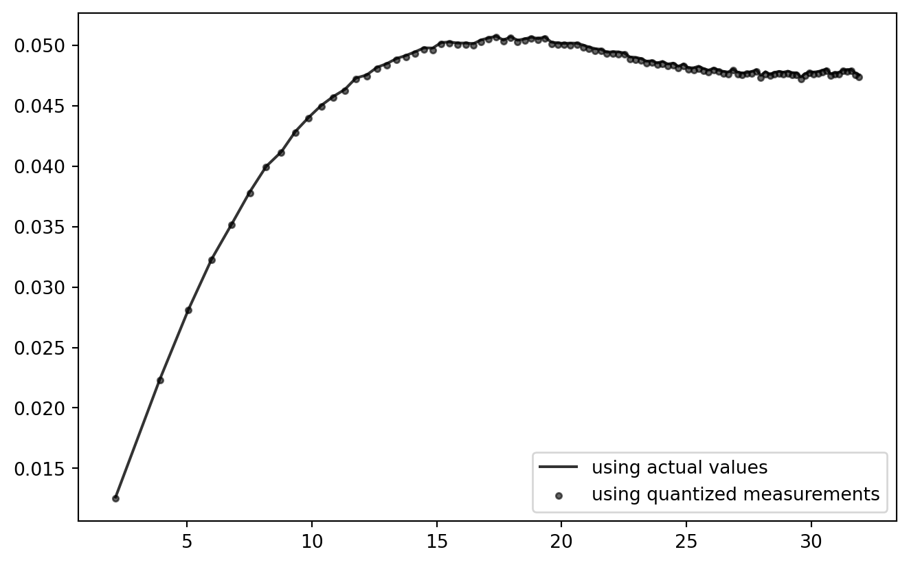
So far, so good! Looks like the current quantization setting has practically zero effect on the outcome of this analysis chain. (But: try using NP.ceil to consequently round up to the next quantum!)
This procedure can be wrapped into a function for further testing.
Single Function
Once this is wrapped into a single function with the main parameters exposed, the playground is open.
However, instead of re-computing everything from the ground up, I will use the prepared main data set with three modifications:
- Subsampling: only a subset of the observations is used for computation.
- Quantization: allows to tweak the quantization steps.
- Transformation: the log- and other transforms can be chosen.
The original data is unaffected, which helps to make the simulation runs comparable.
trafo_catalogue = {
    "noop": lambda x: x,
    "log10": lambda x: NP.log10(x),
    "log": lambda x: NP.log(x),
}

def subset_simulation(n_subset = 2**12, quantization_step = 0.005, trafo = "noop", n_bins = 128, show_plot = False):
    subset = data.sample(n_subset, replace = False).copy()

    trafo_fcn = trafo_catalogue.get(trafo, lambda x: x)

    # quantize
    subset["zq"] = quantize_values(subset["z*"].values, resolution = quantization_step)

    # distance
    dist = quick_lt(crossdist_df_wrap(subset))

    diff_subset = PD.DataFrame.from_dict({
        "idx1": quick_lt(idx_matrix(n_subset)),
        "idx2": quick_lt(idx_matrix(n_subset).T),
        "dist": dist,
        "dz*": compute_diff(subset["z*"].values, trafo = trafo_fcn),
        "dzq": compute_diff(subset["zq"].values, trafo = trafo_fcn),
        "dist_bin": sort_into_equibins(dist, n_bins)
    })

    # variogram grouping
    grouped_diff_df = variogram_analysis_prep(diff_subset)

    if show_plot:
        PLT.gca().scatter(
            grouped_diff_df[("dist","mean")].values,
            grouped_diff_df[("dzq","mean")].values,
            s = 3,
            alpha = 0.2,
            color = "0.4",
        )

    return(grouped_diff_df)
Wrappers atop of wrappers.
def SimulationRound(settings, n_straps = 8):

    for i in range(n_straps):
        _ = subset_simulation(
            show_plot = True,
            **settings
        )

    gddata2 = subset_simulation(
        n_subset = n_observations,
        show_plot = False,
        **{k: v for k, v in settings.items()
           if not (k == "n_subset")}
    )

    PLT.plot(
        gddata2[("dist","mean")].values,
        gddata2[("dz*","mean")].values,
        alpha = 0.6,
        color = "k",
        label = "actual values"
    )
    PLT.scatter(
        gddata2[("dist","mean")].values,
        gddata2[("dzq","mean")].values,
        s = 8,
        alpha = 0.8,
        color = "k",
        label = "quantized measurements"
    )

    PLT.gca().set_xlabel("distance")
    PLT.gca().set_ylabel("difference in\n(optionally quantized)\nlog measurements")

    PLT.gcf().tight_layout()

    return(PLT.gcf())

PLT.close()
It’s wrappers all the way down!
simulation_settings = {
    "quantization_step": 0.01,
    "trafo": "log10", # one of "noop", "log10", "log"
    "n_bins": 128,
    "n_subset": 2**10
}

fig = SimulationRound(simulation_settings)

q = simulation_settings['quantization_step']
t = simulation_settings['trafo']
b = simulation_settings['n_bins']

# store the figure for later
if t == "log10":
    # special settings for detail comparison
    PLT.gca().set_ylim(0.02, 0.08)
fig.savefig(f"figures/t{t}_b{b}_q{q}.png", dpi = 300)
PLT.show()
PLT.close()
!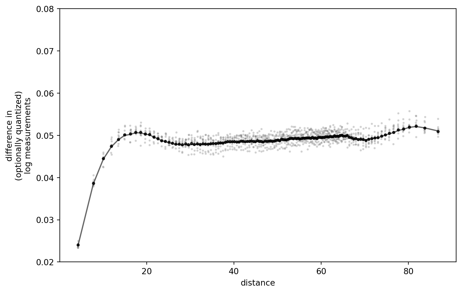
I have played around with the settings, and retained the outcomes locally.
Some key observations:
- The difference of the “real” data (black line) and results after quantization are negligible with the quantization step I chose above (
0.01, in a value range of[0.1, 0.17]). - The present transformation option matters little. Noop, Log, Log10 - all the same.
- Number of bins: the more, the better (resolution), but no notable shift of values.
- More realistic sample size (bootstrap-like subsetting) increases the uncertainty, as one would expect. No extra insight there.
However, one key parameter actually does make a difference: the quantization step.
The Quantization Step
Now watch if we increase the quantization step.
Note: I have compiled and rendered this notebook multiple times. It seems that the outcome can go both directions.
simulation_settings = {
    "quantization_step": 0.05,
    "trafo": "noop",
    #"trafo": lambda x: NP.log10(x),
    "n_bins": 128,
    "n_subset": 2**10
}

fig = SimulationRound(simulation_settings)
PLT.show()
!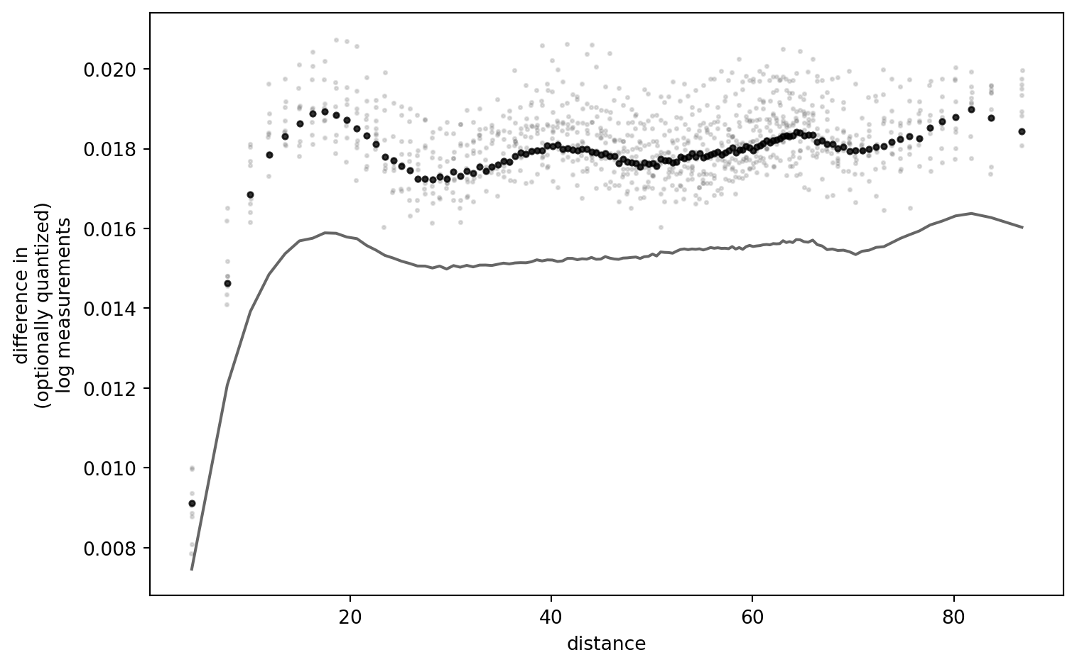
I am still thinking about this result, trying to falsify myself. It is striking that, for low quantization resolutions (i.e. narrow quantization “buckets”), the outcome curves are a near-exact match. Only if I set the quantization step so large that the data interval does not span buckets symmetrically, (strong) differences appear. (One quant which is always asymmetric is the one below the lower detection limit.)
I conclude that there is more work to this puzzle: the effect I elicited here is caused by the relation of data interval and quantization resolution.
Deduction
It is insufficient to just show that there is a difference with certain settings, without understanding where it comes from. A more mechanistic approach is desirable. Furthermore, the applied quantization is quite drastic (but then, again, what do I know about Flemish soil phosphate).
I will tackle this fundamental, but niche question by attempting yet another approach.
Say our data set contains all possible values in a given data range. We fix the distance, without loss of generality (no matter which bin we are in, result will be the same). We can cross-compare the hypothetic measurements. And again, after quantization.
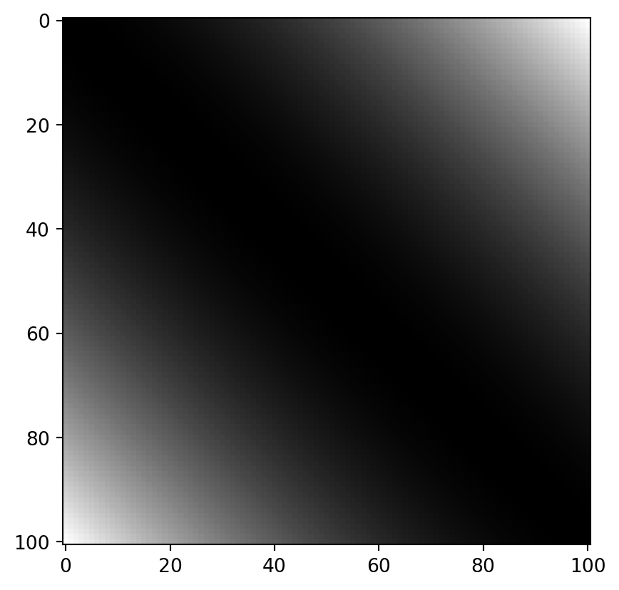
To illustrate, take a vector of all values within the interval \(\left[0.0, 1.0\right]\).
x = NP.linspace(0., 1., 101)
print(x[:5], "...")
[0. 0.01 0.02 0.03 0.04] ...
The cross-differences of all these values look as follows:
dx = NP.round(NP.power(NP.subtract.outer(x, x), 2), 8)

PLT.imshow(dx, cmap = "grey")
PLT.show()
!
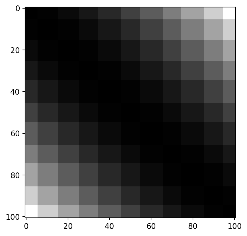
If we quantize the values with a width of 0.1, they look like this:
q = NP.round(x / 0.1, 0) * 0.1
dq = NP.round(NP.power(NP.subtract.outer(q, q), 2), 8)

PLT.imshow(dq, cmap = "grey")
PLT.show()
!
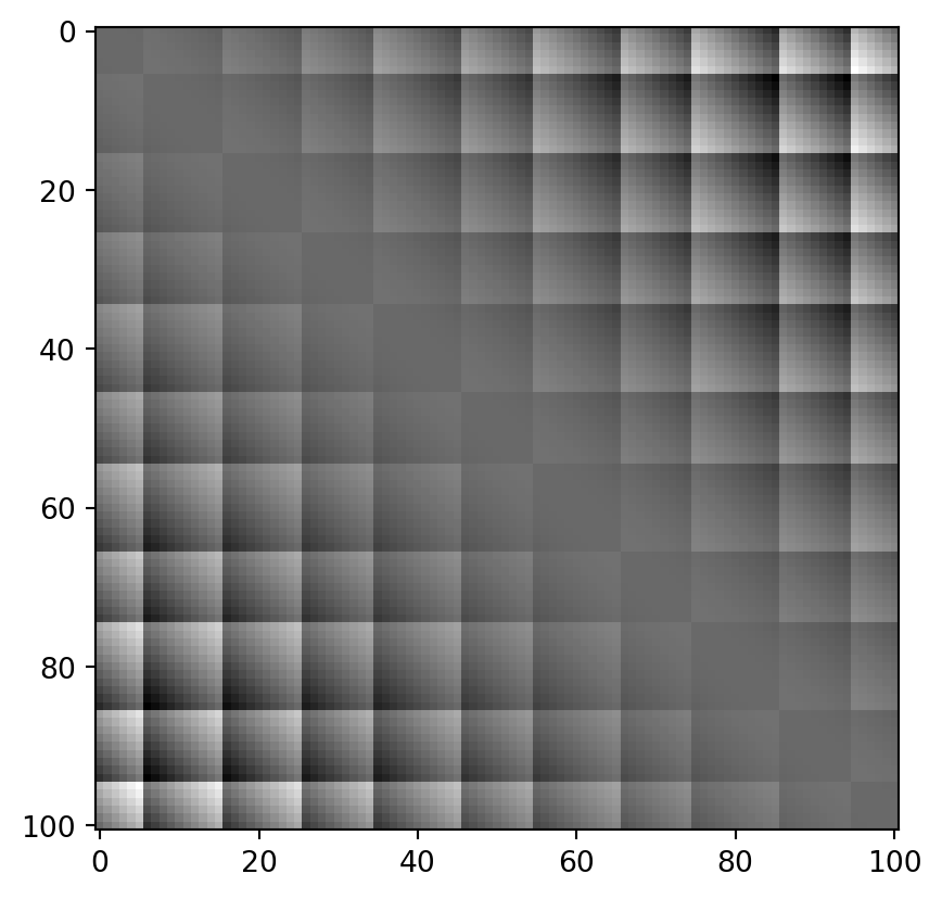
… which differs from the real values as follows:
PLT.imshow(dq-dx, cmap = "grey")
PLT.show()
!
If we also log-transform:
trafox = NP.log10(x)
trafoq = NP.log10(q)

# remove infinites and nans
finites = NP.logical_and(NP.isfinite(trafox), NP.isfinite(trafoq))
trafox = trafox[finites]
trafoq = trafoq[finites]

dlogx = NP.round(NP.power(NP.subtract.outer(trafox, trafox), 2), 8)
dlogq = NP.round(NP.power(NP.subtract.outer(trafoq, trafoq), 2), 8)

fig, axarr = PLT.subplots(2,2)

axarr[0, 0].imshow(dlogx, cmap = "grey")
axarr[0, 0].set_title("real")

axarr[0, 1].imshow(dlogq, cmap = "grey")
axarr[0, 1].set_title("quantized")

axarr[1, 1].imshow(dlogq-dlogx, cmap = "grey")
axarr[1, 1].set_title("difference")
axarr[1, 0].set_visible(False)
PLT.show()
!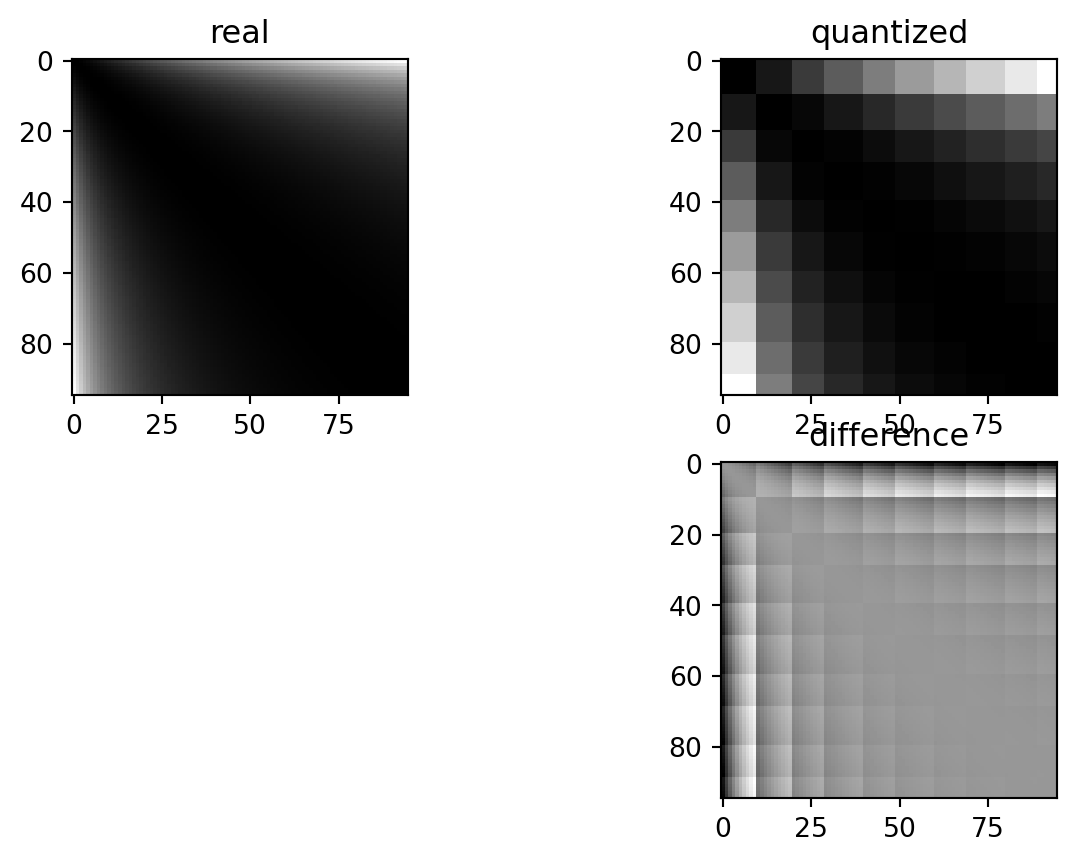
These differences depend on the exact quantization bin each of the paired values is sorted into. In a standard setting, the errors are nice and symmetric: values which land in quantization “buckets” are always symmetrically spaced around the only value which matches exactly that quantization “bucket”. This is logical: depending on which side of the bucket either of the two measurements falls, they are rounded to either side.
The log transformation locally (i.e. within the buckets) removes some of that symmetry.
To get a flexible, quantitative overview of the total effect, it is again useful to have an empowering Python wrapper function.
# interval = [0., 1.]; n = 100; trafo_fcn = lambda x: x; quant = 0.05

def ComPaireWise(interval, n, trafo_fcn, quant, title = None):

    # execution order is important: quantization first, trafo second, then differences

    # quantization
    x = NP.linspace(*interval, n+1)
    q = NP.round(x / quant, 0) * quant

    # transformation
    trafox = trafo_fcn(x)
    trafoq = trafo_fcn(q)

    # remove infinites and nans
    finites = NP.logical_and(NP.isfinite(trafox), NP.isfinite(trafoq))
    trafox = trafox[finites]
    trafoq = trafoq[finites]

    # cross differences
    dx = NP.round(NP.power(NP.subtract.outer(trafox, trafox), 2), 8)
    dq = NP.round(NP.power(NP.subtract.outer(trafoq, trafoq), 2), 8)

    # plot distribution per outcome quant
    SB.violinplot(
        {"x": dx.ravel(), "y": dq.ravel()},
        x = "y", y = "x",
        width = 10,
        inner = "quart",
        alpha = 0.6,
        density_norm="count",
        bw_adjust = 0.4,
        native_scale = True
    )

    PLT.gca().set_aspect(1.)
    PLT.gca().set_ylabel("actual difference")
    PLT.gca().set_xlabel("difference after quantization")

    if title is not None:
        PLT.gca().set_title(title)

    PLT.show()
The reason for a lack of visible skew by quantization is a combined effect of symmetry and the law of large numbers.
ComPaireWise(
    interval = [0.01, 0.99],
    n = 98,
    trafo_fcn = lambda x: x,
    quant = 0.1,
    title = "effect of quantization, identity transformation"
)
!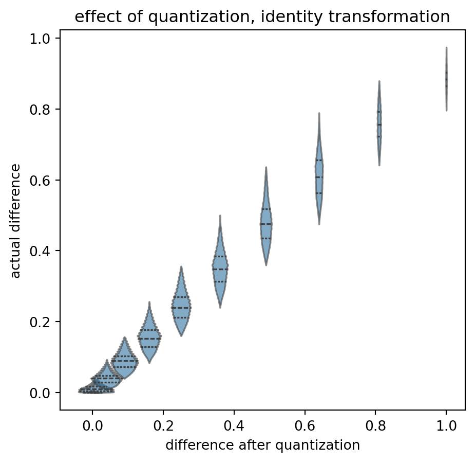
Again, starting with the base case: no transformation, no quantization. “On average”, the actual differences (read as “input from the left”, displayed on the y-axis) end up in the correct quantization bucket (value on the x-axis). A y-value of \(0.4\) is relatively likely to end up as 0.36, and less likely to be shifted to the \(0.49\) bucket. The “violins” fall on a “y=x” diagonal and have limited overlap.
All relatively symmetric. Certainly not exactly symmetric. And note that the overlap itself is an effect of quantization: I think that it is not good that the same actual difference can end up in two different results. That is without transformation.
What if we now apply a log transform?
ComPaireWise(
    interval = [0.01, 0.99],
    n = 98,
    trafo_fcn = NP.log10,
    quant = 0.1,
    title = "effect of quantization, *log* transformation"
)
/tmp/ipykernel_9364/2914448041.py:13: RuntimeWarning: divide by zero encountered in log10
  trafoq = trafo_fcn(q)
!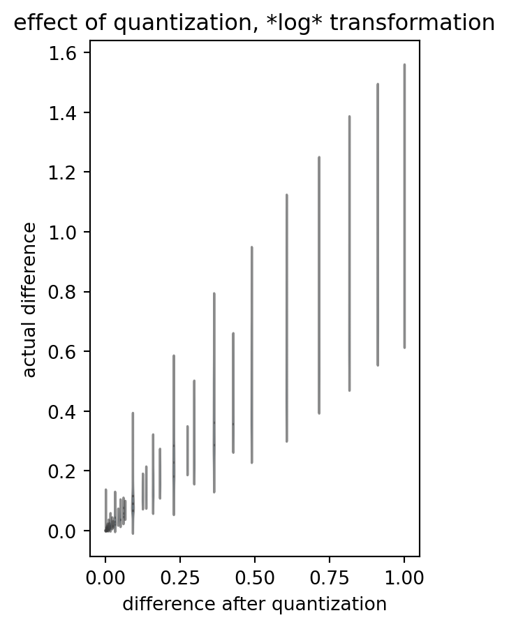
(Please ignore the warnings due to some zero’s and ones in the data.)
Please note the loss of symmetry: many distributions go haywire. One difference value in our analysis outcome can stem from a large variety of actual differences, and one actual value can end up in different bins of quantized-logarithmized-differenze. Even the outcome value interval seems to be capped: we deviate from the “y=x” identity.
What on the other side of the log?
ComPaireWise(
    interval = [1.01, 1.99],
    n = 98,
    trafo_fcn = lambda x: x,
    quant = 0.1,
    title = "effect of quantization, identity transformation"
)
!
Again, rather symetric, some edge effects, increasing distance between difference bins, but okay, I do not want to be too fuzzy. It might average out.
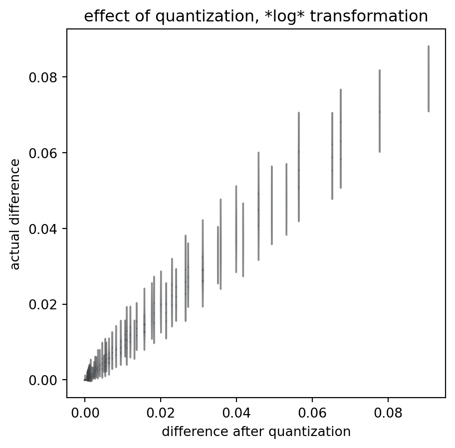
The log above handled values smaller than zero. How about log(1+x)? Applying the log-transformation, at two distances from the log’s x intersect:
ComPaireWise(
    interval = [1.01, 1.99],
    n = 98,
    trafo_fcn = NP.log10,
    quant = 0.1,
    title = "effect of quantization, *log* transformation"
)

ComPaireWise(
    interval = [5.01, 5.99],
    n = 98,
    trafo_fcn = NP.log10,
    quant = 0.1,
    title = "effect of quantization, *log* transformation"
)
!
!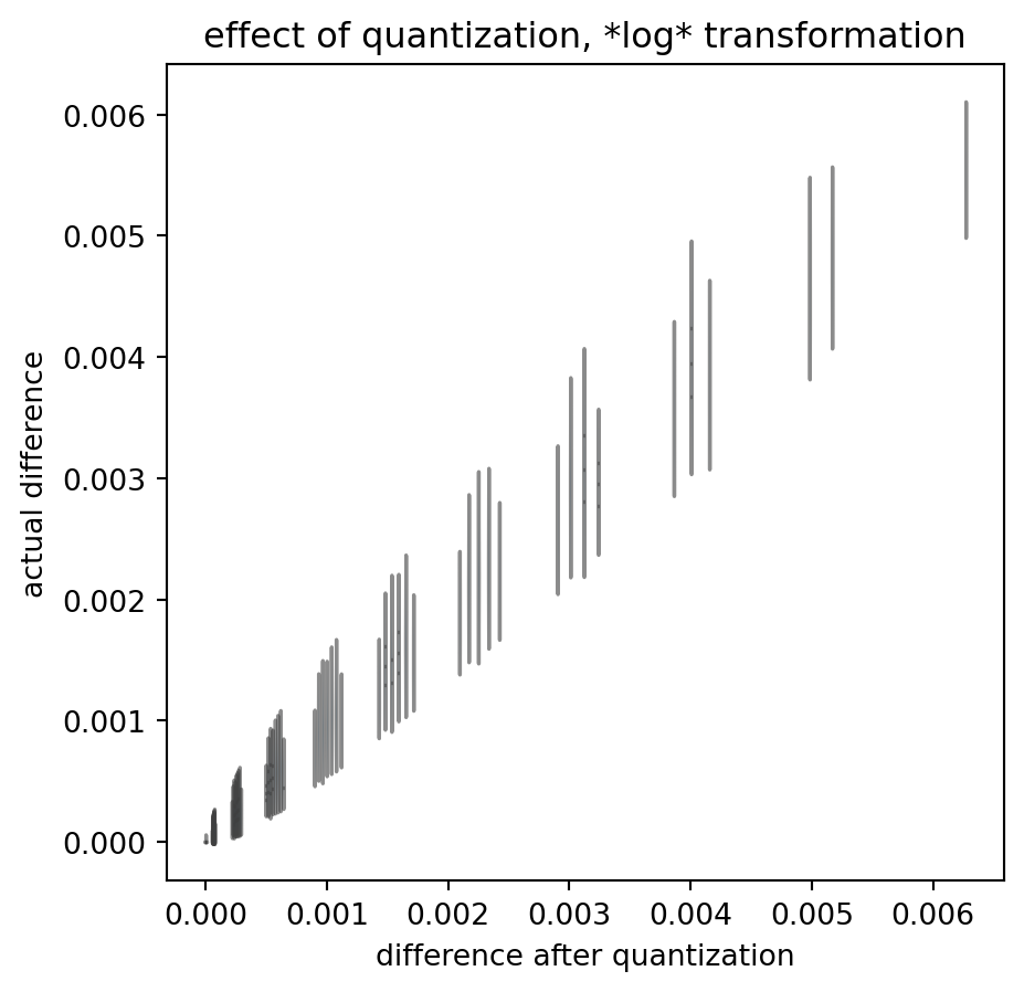
These quantized outcomes have little relation to the actual data differences. And that is true despite the fact that I chose the actual data to scan-sample the interval in regular, dense steps: real data is much more sparse.
Summary
To summarize: I have demonstrated that symmetry of errors can mask an unwanted effect of measurement quantization if we apply all the consecutive steps of a variogram analysis procedure.
But that is not a general rule, and certainly not if we apply a log transform.
Quantization in measurements does lead to ambiguity in outcome: the exact same true difference value can enter the analysis data flow as two different measured differences, depending on the arbitrary direction in which quantization shifted the actual values. (Remember my brief switch of round and ceil above?)
Ambiguity is bijective - the modification procedure is not.
In my opinion, this generally prohibits variogram analysis on quantized values.
Open Questions:
- Have I made a programming mistake? Please double check.
- Is actual sample size big enough to expect the law of large numbers to kick in?
- What are the actual real(istic) values for quantization, value intervals, etc.?
- How could the major asymmetry at the lower limit affect the data (agian, in relation to the hypothesized / true value range)?
- Does this matter for an assessment of spatial coupling in groundwater chemistry? (I.e. what if quantization asymmetrically leads to increase of the sill, less effect on the nugget, so we systematically overestimate spatial variability.)
As a sidenote: there are some Python tricks above, and almost the whole procedure of variogram analysis, broken down to Python functions. I sincerely hope that this is useful to anyone!
Appendix: Return of the Raw Data
Another quick double check whether the log transformation itself introduces a bias for the proximal distances.
What if we remove the Gauss step, i.e. apply our computation chain to a data set which contains exactly zero spatial correlation?
data = data.loc[data["z"].values > 0, :]
data["zq_ungauss"] = NP.ceil(data["z"] / 0.05) * 0.05


diff_data = PD.DataFrame.from_dict({
    "idx1": quick_lt(idx_matrix(data.shape[0])),
    "idx2": quick_lt(idx_matrix(data.shape[0]).T),
    "dist": quick_lt(crossdist_df_wrap(data)),
    "dz_ungauss": compute_diff(data["z"].values, trafo = NP.log10),
    "dzq_ungauss": compute_diff(data["zq_ungauss"].values, trafo = NP.log10)
})

diff_data = diff_data.loc[diff_data["dist"].values < max_dist, :]
diff_data["dist_bin"] = sort_into_equibins(diff_data["dist"].values, 100)


grouped_diff_data = diff_data.groupby("dist_bin").agg(
    {
        "dist": [NP.mean],
        "dz_ungauss": [NP.mean, NP.var],
        "dzq_ungauss": [NP.mean, NP.var]
     }
)

print(grouped_diff_data)
               dist dz_ungauss           dzq_ungauss
               mean       mean       var        mean       var
dist_bin
0          2.135587   0.489304  0.136526    0.398862  0.095445
1          3.899984   0.490258  0.137557    0.398569  0.095226
2          5.043704   0.489706  0.135276    0.399180  0.094872
3          5.975839   0.489315  0.135503    0.398289  0.095126
4          6.777436   0.493345  0.137464    0.401539  0.095923
...             ...        ...       ...         ...       ...
96        31.435484   0.488925  0.136244    0.398689  0.094953
97        31.597608   0.489641  0.134481    0.398942  0.094205
98        31.758973   0.491206  0.135521    0.399899  0.094687
99        31.920006   0.491446  0.136148    0.401112  0.095696
100       31.999933   0.507315  0.088837    0.392133  0.055597

[101 rows x 5 columns]
Visualization:
gddata = grouped_diff_data.iloc[:-1, :]
PLT.plot(
    gddata[("dist","mean")].values,
    gddata[("dz_ungauss","mean")].values,
    color = "k",
    alpha = 0.8,
    zorder = 2,
    label = "using actual values"
)

PLT.scatter(
    gddata[("dist","mean")].values,
    gddata[("dzq_ungauss","mean")].values,
    s = 10,
    color = "k",
    alpha = 0.6,
    zorder = 1,
    label = "using quantized measurements"
)

PLT.gca().set_xlabel("distance")
PLT.gca().set_ylabel("difference in\n(optionally quantized)\nlog measurements")
# PLT.gca().set_ylim([0., 0.5])
PLT.legend()
PLT.show()
!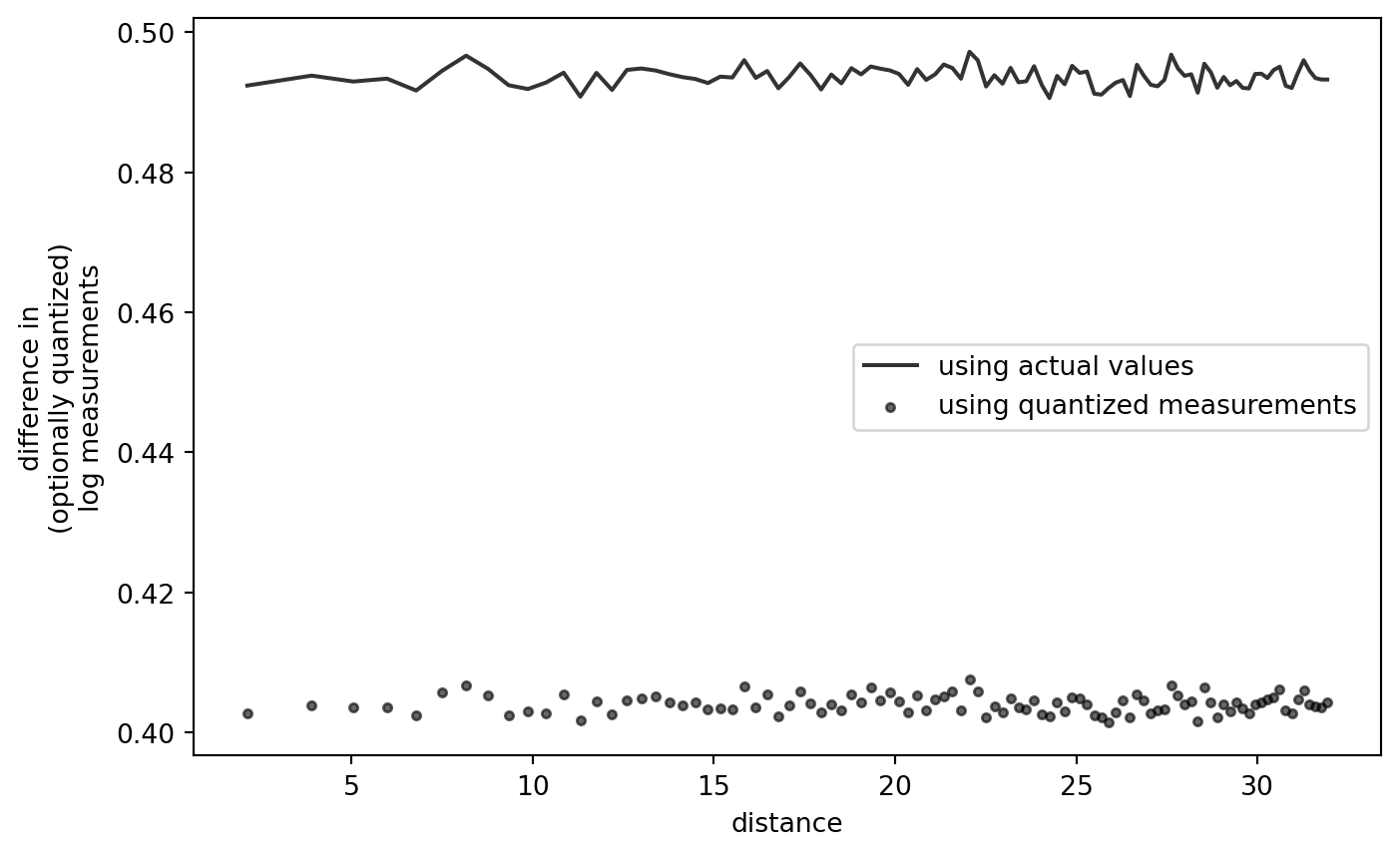
This confirms that the shape of the variogram, quantized or not, is not an artifact of the quantization-log-difference procedure itself.